Sunday, 11 March 2012

Communication is a Virus // Final Products

Here are the final products for our group project. I am really happy with the outcome of all the pieces of work. Everyone has worked well on this brief to come up with a set of products that work as a series.

My final CD and insert

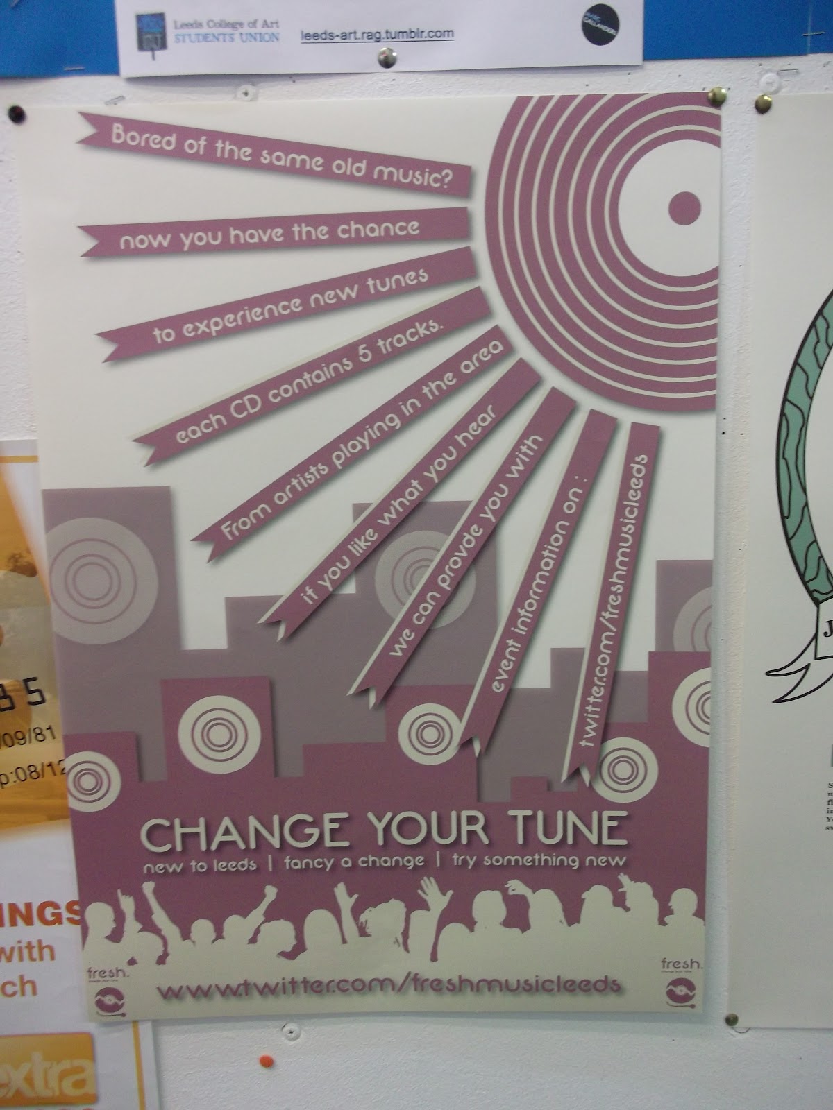
Posters in practice. We managed to get hold of a plastic holder to distribute the CD's which proved very effective.


Emily & Mine
 Jazz - Sophia & Indie - Lisa
 Motown - Kate


Thursday, 8 March 2012

Reggae CD and Insert

I have designed an insert for my CD which has the track listing on, and also a little bit about the concept. I have also designed a sticker which will be stuck on the CD.
 As Weed is a huge part of reggae I have decided to create
a sticker of some purple haze! as this has a link to the colour
scheme and genre
I quite like the shape used here. I have tried to fit the text in the 
sections but this has been difficult.

 Ganja Leaf overlay?
I think this is my favourite I have repeated my ganja leaf // lion of judah
pattern to create consistency.

CD TRACKLIST
  1. From the congo square - The Caroloregians
  2. Zion Youth - Dreadzone
  3. Could you be loved - The Wailers feat Bob Marley
  4. Police and thieves - Junior Murvin
  5. Murderer - The Skints

FINAL POSTER IDEAS

Here are my 3 final poster ideas:


Wednesday, 7 March 2012

3D Type - Design Principles

In the sesion we looked at creating a letter across 3 plains like the channel 4 adverts. This meant we had to create a viewfinder to add at the end of the table so that when we looked through viewfinder the letter would be visible. But from any other angle it just looked like random bits of hanging card.
We chose to work with the letter S. We thought about different ways of creating the letter but decided to hang the card mainly. We simplified the form by choosing a block, sans serif font which would be easier to produce with the large scale cardboard when cutting out. We also found that suspending flat pieces of the top two sections of the letter made the letter form work out better when viewed in the viewfinder and easier when making each plain.
 
Here is what we did:


After this we had the challenge of adding two extra plains to the letter that could improve the existing one we had created or a new letter form entirely. We decided to create a lower case 'g'


COMPLEMENTARY CONTRAST PANTONEThe contrast is formed by the juxtaposition of color wheel or perceptual opposites. EXPERIMENTS

The contrast is formed by the juxtaposition of color wheel or perceptual opposites.

I have experimented here using coloured card
to create complementary contrasts.