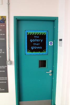
I decided that instead of printing out my signage with James I would use card and the laser cutter. I had quite a bit of trouble at first with trying to find the right stock to use. I wanted to use a bright green luminous stock to try and grab peoples attention, after not being able to get any I have realized that it might look quite tacky so I decided to use an emerald green stock and a nice aqua blue. These colours fit in with the glows of the organisms, which tend to glow either blue or green.
Laser Cutting Session
After some hard crafting I managed to piece each sign together.
This is my favourite version the black highlights the darkness
the contrast between the colours works well.
Colours work well together and relate to my illustrations.
Smaller Versions / White Background
Not sure whether the white works as well
THE GALLERY
I set up the exhibition in the Tutorial Room on the 1st Floor next to the Studio. The colour of the door fits in with the exhibition as it kind of looks like an ocean blue which works well. I think the Sign works well in context and definitely makes you want to see more.


No comments:
Post a Comment