| BRIEF |
Produce an alphabet based on one of the letter forms you created from the Alphabet Soup, Visual Thinking brief. You are restricted to using black and one colour and it is to be produced in CMYK (cyan, magenta, yellow, key). Although you are restricted to one colour you experiment with opacity and half tones. You should use your research and experience to date as well as your studio based visual investigations as a starting point. You will use Abobe Illustrator as a tool for visual investigation. |
| Background / Considerations |
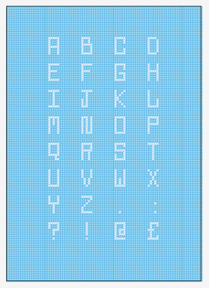
One of the problems with software is that everyone has access to it but not everyone knows how to use it creatively. Abode illustrator is primarily used for the generation of vector-based images and as a type tool. When used as a means for visual investigation it offers the potential for rapid generation of visual variations. The possibilities of which can used as a springboard for further visual research. Think visually. Consider what the visual essence of your subject matter is and how best to communicate it. How can these letterforms that you created be developed further now that you are working digitally? Initial Stages This all stemmed from the series of letter forms I made for the word "POP," I initially scanned them into the computer and brought them into illustrator to pay about with them. Here are my original letter forms.  I started with a kind of pop art / fizzy pop style which moved into a 60s pop font then finally popcorn. Here is what I started in Illustrator 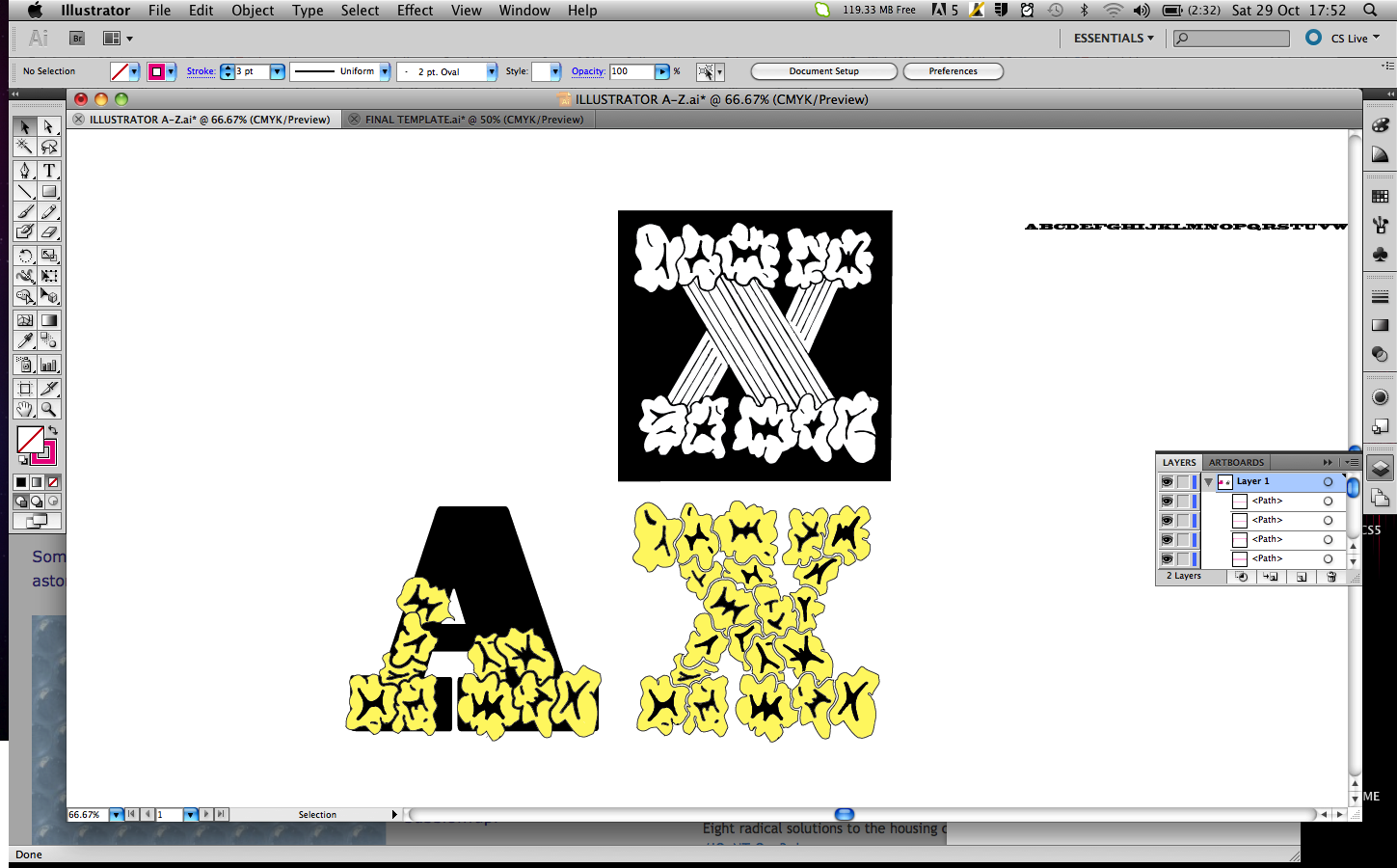 I live traced my letters in and played about with the shapes to slot the popcorn together to make other letter forms.  I wasn't really happy with where this was going so I decided to steer away from this design and concentrate more on the 60s pop font style typography.  Using the rectangle tool and the pen tool I was able to create a 60s pop font based on the existing font Blackoak Std. Certain letters worked well but I was starting to struggle.    I was not happy at all with the fonts I had created so I decided to look at a different aspect of pop, I decided to look at bubble wrap. I found an image of some bubble wrap then copied the pattern. After a long time of duplicating the pattern I was able to cover the entire A1 Sheet in the bubble wrap pattern.  I started to change the colours of bubbles to make letter forms. I quite like the wacky look of the letters, but because of the pattern it was hard to get consistency within the letters, some of them just didnt fit in very well.  The alphabet is starting to take shape here it does'nt look too bad, but I found it so difficult to space the letters evenly that I am unsure about it.  I have decided to take another approach to the font. I decided individual bubbles would make up the letter forms better. But this was too difficult to space each bubble out evenly also.  Here ye can see the individual bubble letters.  I was trying to space the bubbles out evenly and in a more ordered fashion but it just made the letters look really wide and silly.  I changed my idea again and went back to the full bubble wrap sheet. But instead of looking at the generic bubble wrap pattern, I created it in a grid format to make it easier to produce letters. This took the piss once again...very time consuming.  I made each letter 8 bubbles high and 5 wide, I spaced the letters out 10 bubbles apart horizontal and 4 bubbles vertically to create a nice grid for my alphabet to sit in.  Here you can see the finished version on Illustrator, I am happy with the out come I think it works well.  Here is the type up close, I tried to give the bubbles a bit of detail. FINAL DESIGN  Type Face in Practice  I think my type face works well in context. It may be difficult to read from afar but I think it still suits its purpose well. I have tried to make the letters as clear and legible as possible. Final Print   |
Sunday 30 October 2011
ALPHABET SOUP//ILLUSTRATOR//OUGD403
Saturday 29 October 2011
Proverbially Yours//Message & Interpretation // The Signs in Context
Sign Placement
I have decided the appropriate place to position my posters would to be in the form of road signs and bill boards. My proverb is a lesson that is relevant to everybody I feel and the posters can be seen on everyone's drive of life. They will be easily visible to all, the only issue may be that people may get confused and think they are actual road signs so I would place the road signs in a position that would not make it confusing.


Crit Feedback
Emily's Feedback

I am quite happy with Emily's feedback, she liked the idea of it and understood it all which is good. She did mention that I should look at Red as a colour, I did look at red in my initial Ideas but I felt this wasn't very road sign like however I do agree with her thinking. She also mentions that I should of varied my images used a little bit, I think this is a good idea and If I had had more time I would of looked into this, i was concentrating more on keeping them in a series. At least now I will know where to make improvements in my development stages when designing, I need a bigger variety of work.
Tuesday 25 October 2011
PROVERBALLY YOURS// MESSAGE & INTERPRETATION
Brief


I really like this design however it doesnt really fit with my landscape posters. I think this works equally as well as the horizontal one. It was a tough decision dropping this from my final 3.
FINAL DESIGNS?


Produce designs for a set of three high impact posters that deliver a personal identified message derived from your given proverb. A proverb (from Latin: proverbium) is a simple and concrete saying popularly known and repeated, which expresses a truth, based on common sense or the practical experience of humanity The three posters should work as a set or series and be visually consistent. The first must be produced solely using type, the second solely with image and the third a combination of both type and image. You are restricted to the use of two colours plus stock. |
| Background / Considerations |
|
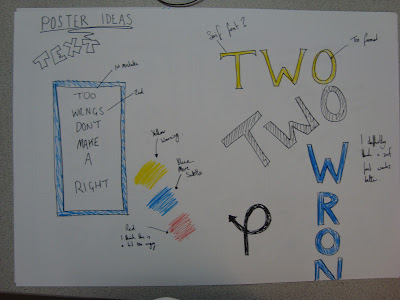
First of all I thought about what could symbolize my proverb. What could represent wrong and right?
- Tick / Cross?
- Thumbs Up / Thumbs Down?
- Happy Face / Sad Face?
- Green / Red?
- Right Turn / Wrong Turn?
- - / +


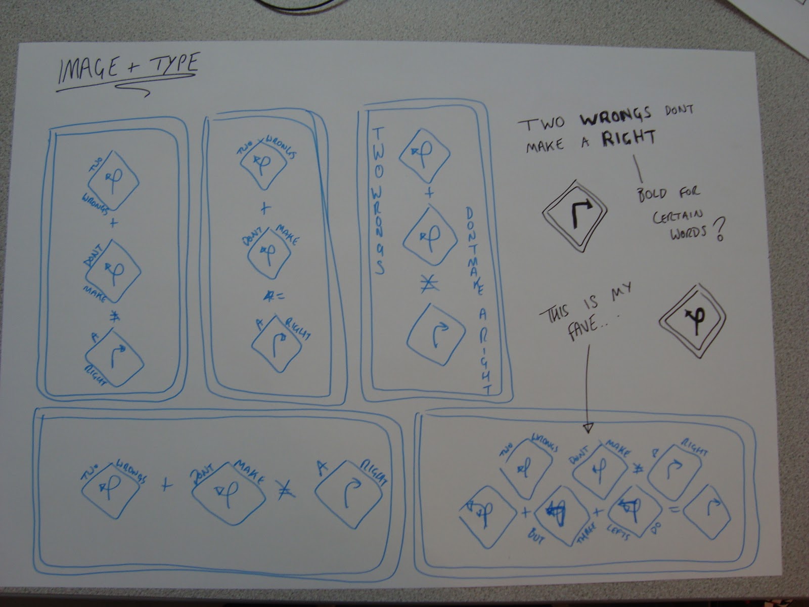
I Tried to come up with a way of representing the wrongs and rights within just text. Here is what I came up with. I made 2 mistakes within each proverb to outline the 2 wrongs. I think this is quite a subtle way of getting the message across.

I kind of changed the proverb a bit. I interpreted "2 wrongs don't make a right" as: if someone does something wrong to you doing something wrong to them doesn't make it right. I decided to add but three lefts do, this was just to give it a bit of humour, the message is still clear but it adds a bit of light heartedness. Also you could interpret the 3 lefts as avoiding doing wrong!


Design Sheets


INITIAL DIGITAL DESIGNS
I started creating digital versions of my ideas on Illustrator, playing about with type and image, Mainly using the text and pen tool. I found the ideas worked well in colour.


I couldn't decide what colours to go for I like the blue as it is easy on the eyes. I thought I could try represent the 2 wrongs and the right by using the red and green having 2/3 red and 1/3 green, But I think this looks a bit tacky.


I also looked at yellow as a possibility as this is the colour of road signs. I thought this would work well but actually it looks a bit ugly, its also a bit cliche so I don't think I will be using this.

I tried different spacings of the signs to see what looks good on the page. Here you can see the signs more spaced out. Although it fills the page it doesn't look right.

I added a border to the image.

I positioned the signs closer together. I think this works better.

Added the X to the =

I started to play with type and image here. I added the proverb to either side of the signs. I think this works rather well.

I think I prefer this layout of the text than the other.
Portrait?
I looked at creating my posters in a portrait layout but I dont think it works as well. Except the just Type poster which I think works better in this layout :/


Here are some of my portrait type and image designs, I'm not keen on the colour, I think I prefer the image on the far left the best. The composition works well.


The colour works well on these posters. However the symbols I added look a bit shitty. I'm not too keen on them, but I was just experimenting. I decided to give the posters texture as it gives them a bit of life. The image on the right has a fabric texture over laid on top of the design.


I added a stained texture but this just makes the image look dirty. I much prefer the fabric overlay, it provides better tones and texture.

I think the yellow works allot better with the fabric texture added to it. It takes away that sickly feeling it gave me before. I still think I prefer the blue but it definitely looks allot better now.

I took away the signs leaving the image to see if this would work but it looks terrible I quite like the idea of making some of the words in Bold though for extra impact. I added a Tyre mark as I thought I would keep with the style of road signs. I feel road signs are easy to take on board as they are designed to be glanced at. I tried to keep my designs quite simple so It could be seen in a similar context to the road sign or bill board?

I decided to play around with the type further. I changed the size and the weight of the text to make it more visually interesting and less dull.

I am happy with this design. It looks interesting and is simple at the same time. I think this will work well on a bill board or road sign. This is somewhere everyone would see it.

I really like this design however it doesnt really fit with my landscape posters. I think this works equally as well as the horizontal one. It was a tough decision dropping this from my final 3.
FINAL DESIGNS?
Here are my final 3 designs. I am quite happy with the outcome, I think the posters work well as a series, they are easy to understand and are also quite eye catching. I wish I had had more time as I was rather rushed this week so I didn't have allot of time for research. I think the colour works well, I have stuck to the guidelines which is always good.
Type + Image

Image

Type

Subscribe to:
Posts (Atom)