Thursday 25 October 2012

Type Workshop - Graham

In todays session we looked at what impression our typefaces give off. You can tell alot about what a company is trying to convey with their choice of typeface. All fonts have characteristics. Serif fonts in general look quite formal and smart where as sans serif is a little bit more casual.


Describe Rockwell in 3 words :


Although Rockwell is a serif font it doesn't come across as Intelligent or posh which I usually associate serif fonts with, Its quite playful and bold, I think the slab serifs give this effect.
I decided to go with the coffe bean coffee shop. Its quite smart but playful at the same time which I thinks represents this shop well. Its still a bit buisnessy but also quite casual at the same time.
Next we had to choose a company the logo does not suit. I went for soap and glory the cosmetics company for woman, usually the branding is quite garish and girly. This serif font takes away that femininity

Kerning Exercise
Even though technology has come on leaps and bounds it seems general word processing programs still have trouble kerning words. Using the tool we had ago at altering the text to make it more neat with even spacing.
Readability Task

In order to test our layout skills we had to carry out a series of tasks. We had to use different methods in order to make the viewerr read the poster how you want them to read it.
Using size as my tool I made the image read 3, 2, 1
Here the position of the text makes it read 1, 2, 3
And finally this should read 1, 2, 3, 4.

This has been a helpful session and has helped me learn the importance of text and hierarchy.


Kerning Research


Introduction

The past few years have seen an explosion of type on the web. It used to be the case that web designers were faulted for not having a strong sense of typography, but nothing could be further from the truth these days as web designers lead the art of typography to new heights of popularity and respect.
Designers have a newfound appreciation for both typographic art and the practical ways in which typography complements and even drives a strong design.
There’s still at least one major topic that web designers tend to miss out on though: kerning. The truth is, kerning on the web is still a nightmare. There are a few options for making the task easier but on the whole, we just sort of ignore it.
As a result, many web designers neither think about kerning nor do they really even understand how it works on a fundamental level. Fortunately, it’s not rocket science. The largest factor involved in learning to kern type is to make yourself aware that it often needs to be done. Below we’ll go over some basic and useful tricks to get you started.

#1 What Is Kerning? Think About Blocks

The first thing you should know about kerning is, well, what exactly it is. There are a lot of funny sounding typographical terms and it’s easy to get confused quickly so it’s necessary to make sure we’re all on the same page.
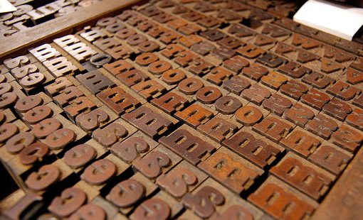
Once upon a time, there were no computers. Type was set, get this, by hand. It’s a crazy concept but believe it or not, the process of bringing a design to life used to be a pretty laborious task, unlike the cushy desk jobs that we now all enjoy.
Back then individuals letters were set onto physical blocks made of wood or metal. Obviously, the nature of the blocks meant that you could only squish two letters together so far, to the point where their edges hit. As a solution to the problem, typographers created sets of notched blocks that fit together like puzzle pieces, thus allowing the letters to move closer to one another when needed.
screenshot
Photo credit: Joel Gillman
The reason that I tell you this is that it gives you something real to picture when you think about kerning. This helps you remember what it is and distinguish it from other typographical terms. Now when you hear the word “kerning,” you’ll picture woodblocks with notches in them and remember how it works.
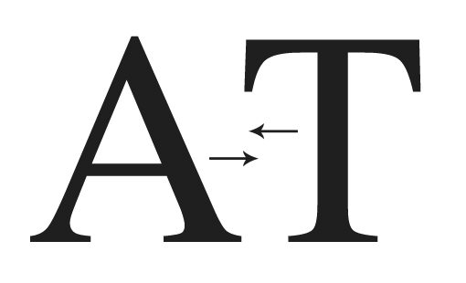
Obviously, these days the art of manual typesetting is a novelty. Instead, this is all handled in the digital realm, right on your computer screen. However, the core concept here is identical. Kerning still refers to the adjustment of space between two letters.
screenshot
The goal is simple: to equalize the appearance of the whitespace between letters. This gets tricky because you really have to feel it out. Sometimes uniform spacing between letters won’t look like uniform spacing and you have to tweak and tweak until the word looks like you think it should. There’s really no magic formula, you just have to eyeball it and decide what looks right.

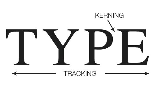
#2 Kerning ≠ Tracking

One thing that trips up most new designers is the difference between kerning and tracking. Don’t make the mistake of mixing these two terms up, old school print designers love to point and laugh at people who do that.
The difference between the two is simple: tracking refers to the uniform spacing between all the letters in a given selection of text and kerning refers to the spacing between two specific letters.
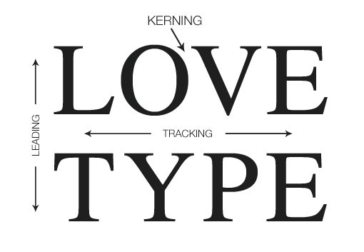
screenshot

Leading

Now, to add even more confusion to this equation, we can throw leading into the mix. Leading (“led-ing”) is the vertical space between lines of type. In CSS we use a similar adjustment called “line-height”.
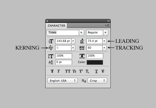
screenshot

In The Type Palette

While we’re on the topic of adjusting all of these values, here’s a quick reference so you know how to spot them in Photoshop, Illustrator or InDesign.
screenshot
Note that the “Option” key (Alt) is your best friend when adjusting any of these, in conjunction with the arrow keys of course. Which one it adjusts depends on your selection and cursor. Place the cursor between two letters and Option+Left/Right adjusts kerning, or with a larger text selection the same commands adjust tracking. Similarly, Option+Up/Down with a text selection will adjust leading.

#3 Letters to Watch

Once you start making it a regular practice to kern your headlines and other important type, you’ll notice that certain letters are more problematic than others.
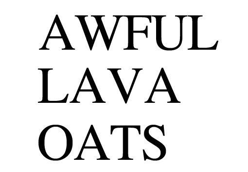
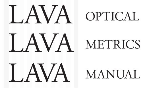
To get a feel for how this works, let’s open up Photoshop, set our kerning to “0″ and type a few words with Times. These results haven’t been tweaked by me at all, they’re genuinely this horrid right out of the software.
screenshot
All caps type definitely tends to be quite problematic so as a rule of thumb keep a close eye on it. However, we find similar problems when we start mixing uppercase and lowercase letters.
screenshot
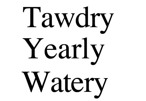
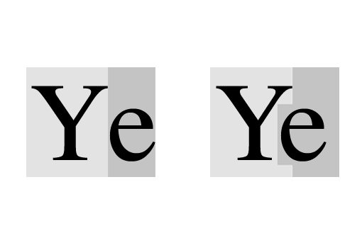
Looking at this, we see a pattern start to emerge. In general, the less a letter conforms to a block shape, the more problematic it becomes. Letters with strong slants like the uppercase “A” and “W” are bound to case some issues, whether they’re mixed with uppercase or lowercase letters. Also, notice how the overhanging bar on the “T” and the arm on the “Y” cause problems when used as initial caps. Here, the lowercase letters that follow are being spaced relative to their block outline, but we need to notch the blocks just like the old typographers:
screenshot
You can find big lists of specific letters to watch, but as a rule of thumb, I generally keep a close eye on letters with diagonal lines like “A” and instances of initial caps (especially when a “T” is involved), no matter what the pairings. Also, though lowercase letters tend to play fairly nicely together, you’re not off the hook with them. Notice the how the “ly” in the example above differs greatly from the “ry” spacing.
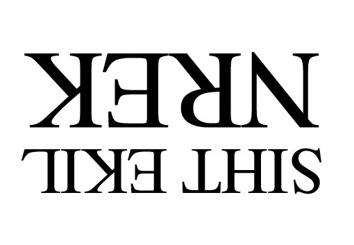
#4 Kern Upside Down

The reason kerning is so easy to miss is because your eyes tend to ignore the spacing in pursuit of reading the word or sentence. After decades of reading, adults don’t see letters anymore, we see words.
To help account for this, some designers suggest the simple trick of flipping your type upside down before kerning. It’s a brilliantly simple technique that really helps you focus on the letter shapes and how they fit together instead of getting distracted by the words.
screenshot

#5 Don’t Kern Before You Decide on a Font

Obviously, letter spacing is going to differ drastically on a font to font basis. On a practical level this means your process should be to choose a font first, then kern.
screenshot
Easy right? We tend to forget this step though when we change our mind on a font at the last minute. At this point, you can’t bank on the kerning that you’ve already done but instead have to pretty much start from square one and treat each font as unique.

#6 Watch Word Spacing

We’ve discussed tracking, leading and kerning but there’s one more area of typography spacing that you really have to watch out for: the spacing between two words. This essentially boils down to the size of a “space” in a font.
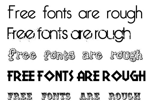
One thing that has really been bugging me lately about free fonts is how many of them tend to have really awkward amounts of space between words.
screenshot
In general, kerning in free fonts can be a pretty bad, but the word spacing tends to be a specific problematic point that you want to keep an eye on. A font with really poor word spacing becomes super high maintenance when you start actually working with it so it’s best to use them sparingly or avoid them altogether.

#7 Don’t Trust the Software

As I outlined in a recent article on general typography tips, Photoshop and Illustrator have a few built in auto-kerning modes. These are great to use, but use them in conjunction with manual kerning, they’re simply not smart enough to handle the task on their own.
screenshot

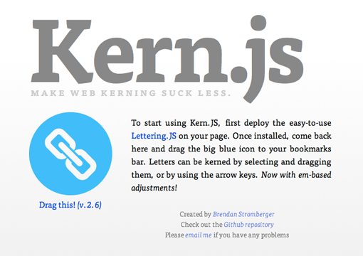
#8 Use Kern.js to Kern Online

All of these tips are great if you’re designing for print or turning your headline into an image, but what about live web type? As I mentioned above, kerning on the web is a pain and many designers suggest just living with poor kerning where web type is concerned. However, recently some great JavaScript tools have been created to make the job a little easier. One of the best I’ve seen thus far isKern.js, an extension of the excellent Lettering.js.
screenshot

Conclusion

To sum up, kerning isn’t the hardest thing you’ll ever do in design, but it can get a little tedious and tends to be something that you flat out forget to do.
Make it a point to keep kerning in mind and to always analyze your letter spacing. Sixty seconds of kerning on every headline you create will improve your typographical competence by leaps and bounds.

Wednesday 24 October 2012

Rockwell Type Comparison

We were asked to create a landscape A4 PDF comparing our chosen type to another. I was given the serif catagory and decided to choose Rockwell as my typeface. I compared it Times New Roman by looking at the charactewristics of each key letter. I needed to consder the :

Ascenders
Cap Height
Construction
Distinctive Upper and Lower Case letters
Serifs
Shape

To start with a typed out the alphabet with both fonts and looked at which letters were considerably different looking at both upper case and lower. I decided to look at the Upper Case 'A', Upper Case 'j' and the lower case 'g'.


 I overlaid each letter on top of each other then drew in the appropriate construction lines to see how the letters differed. First of all I noticed the Times New Romans uppercase ‘A’ has tapered serifs, and has a much thinner and lower cross bar in comparison to Rockwells, which has thick slab serifs on the top and bottom.


I noticed Rockwells upper case ‘J’ extends all the way to the baseline with a vertical terminal wheresas Times New Roman’s ‘J’ sits on the baseline with a teardrop style terminal.


This was probably one of the biggest differences. Times new romans lower case ‘g’ is a double story letter with a link and loop, this is very different to Rockwell’s which has an open tail that decends from the right.


Web Design Workshop - Lorraine

PURPOSES OF A WEBSITE

Promote
Educate / Inform
Persuade
Contact
Entertain
Usability
Functionality
Aesthetically pleasing

Always question if what you are doing is necessary. Content is massively important scrutinize everything.

Initial Website Design 


Feed Back

Simple but clear layout, easy to navigate and would show of your work without confusion. At the bottom you have contact details but you also have a contact page, do you need both?

Too much going on, on the first page, Nothing really stands out on the page (Hierarchy). The text might get hidden. The preview boxes should be smaller or less on the page. What colours will you use?

I would prefer the images to be straight edged as I don't think the curved edges look as sleek and profesional as they should for a graduates website. The about, contact and shop would look better not boxed up.

I dont personally like rounded boxes it makes it look a bit retro.Previews of work appear a bit too much. Might be better with one central image. Would prefer it without boxes this would make it more clear and legible. Easier to navigate.

I like the layout and how it is centrally focussed. Will the about, contact and shop button be permanent? What choice of font will be clear + bold, eye catching. Like how it showcases work immediately  this works well with the 5 second rule. Unsure of the rounded boxes but like the use of grid.

Clear layout which is easy to navigate. Modern fonts are good. Why is the portfolio link separate.

Too many previews of work, may be a bit too much to look at. If the contact details are on every page, why have a separate contact details page?

Web Design Workshop - Simon

DESIGNING FOR WEB

We have been asked to judge a list of websites in the first 5 seconds, we have to shut out words, either good or bad to work out our initial reactions.

Content should make the website good, not the design! The design should 
be functional and the content appealing.

ollymoss.com - Bland, dark, empty, boring, small, plain, dull, simple
malikafavre.com - Fun, colourful, hectic, bright, GIFs, bright, eye catching
360langstrasse.sf.tv/page/ - Plain, photography, german, google street view
mercertavern.com - Hipster, smart, clean, retro, vintage, black and white, monotone, boxes
noble-design.co.uk - Vector, colourful, smart, girly
caavadesign.com - waves, photoshop, colourful, CD, simple
sb-studio.co.uk - photo, clean, swedish, clinical
smart-heart.ru - minimalist, smart, interactive
formfiftyfive.com - machine, interactive


When Designing a Website consider:

What is the purpose of the website?
Who is the target Audience?
What do the target audience need?
Type, Image and Navigation

How can you find this out?


- Create surveys for the target audience.
- Look at similar websites with the same target audience.

- Research Studios
- Ask studios what they want to see.
- Be creative with emails.

Web Limitations

- You can only use the standard fonts, you have to buy font families.
- Work in RGB - web safe colours.
- Size of the site - width and height
- 72 PPI - but most computers have 96 PPI
- Retina display 227 PPI
- 800 x 600 - Simons standard website size


HTML & CSS Design and Build Websites


For next week draw out how you want the website to look
draw a site map also - where the home page will link to etc.

Web Terminology

HTML - HyperText Markup Language
URL - Uniform Resource Locator
CSS - Cascading Style Sheet
FTP - File Transfer Protocol
CMS - Content Management System

WEB DESIGN TERMINOLOGY

Below is a list of some of the most commonly used terms in web design and development.
Animation
The creation of a series of graphic images or frames so that they have the look of moving continuously. This can include simple animation (created using .gif files), the appearance of animation with JavaScript, or more complex animations using Flash.

Broken Links
Hyperlinks, or links that fail to open a web page, usually producing an error page instead.
Composite (Comps)
The look of the website without actually creating it. This is achieved with graphics only, and is usually presented to the client in printed form or as an attachment in an email.

Contact Page
The page in a website that contains all information as to how to contact a business or individual. This usually includes a mailing address, phone number, fax number, email addresses and any other criteria that may be necessary. This page can also include a map and directions.

Content
The body of a web page. Content includes words, selling points, graphics, animations, etc. that do not comprise the framework of the page. This is the information that changes from page to page.

Debugging
Detecting, locating and correcting errors or problems in a computer program or web site.

Design
The process and art of creating a Web page or website. It may involve both the look and mechanics of how a website works. Some of the features that make up design are:
graphic creation
animation creation
color selection
font selection
navigation design
content creation
HTML/XML authoring (known as scripting)
programming (PHP, .net, ColdFusion, Perl, JavaScript)
ecommerce development (requires programming)
Design Process
The method that carries a client and their web designer from the idea of a website to the actual creation and implementation of a website.

Digital Photography
Using a digital camera to take photographs. A digital camera stores the pictures electronically and can then place them directly on a computer. An alternative is to scan regular photographs that have been developed and place them on the computer. Scanned photos are usually not as clean and clear as those taken with a digital camera.

Domain Name
Allows you to reference Internet sites. To register a domain name, you can contact an online company that sells them or you can ask your web designer, Internet Service Provider or site host to register your name for you. A few domain name suffixes (also known as top-level domains) are:
.com for businesses (the most commonly known suffix)
.net for networking companies, ISPs, and Web hosting companies
.org for non-profit organizations
.me for personal sites like MaryMorris.me
.info for information sites
.biz for businesses
.edu for educational institutions
.gov for government institutions
.mil for military institutions
Dynamic Content
Interactive features on a website. The content the user sees is sometimes updated based upon the users input. Dynamic content can be information stored in a database, user input, or even cookies. Forms and a Search option on a site are perfect examples of dynamic content.

Graphics
A picture or image produced on a computer. These can include .bmp (bitmaps), .jpg (joint photographic experts group), .gif (graphical interface format), and .png (portable network graphics).

Forms
Interactive elements which allow a user to input information to be utilized by the website. Forms can be used to gather information supplied by the user in order to help the user interact with various components within the site.

Homepage
The entry page to a website, also known as the index page. Often mistakenly referred to as the "Portal" page.

Hosting
Most commonly thought of as the place (think of a heavy-duty computer) where your website's files reside. An Internet host has a unique Internet address (IP address) and a unique domain name or host name. A host can also refer to a Web hosting company.

Logo
A company's symbol used to "brand" that company in the customer's mind. Think of the "swoosh" Nike uses.

Maintenance
The act of upkeep for a website. This can include updates, changes, re-design, and troubleshooting.

Marketing
The process of planning and executing the promotion of a website via printed and other media, and the Internet. How you make others aware that your website exists.

Search Engine
A program (website) designed to search a database of information from and about other websites. Google, Yahoo and others use this kind of program to create a directory of sites which you can then search through.

Search Engine Optimization
Search Engine Optimization (SEO) is the skill of designing (or re-designing) a website so that search engines will rank it higher for a particular set of keywords.

Server
A computer that delivers web pages to users. It is the "computer" where website files (the whole website) reside and are accessed through the Internet. A server can also be called a host or node.

Target Audience
Groups of people who are considered a marketing strategy's main objective. For instance, toys are marketed toward the Target Audience of children within certain age ranges. Target Audiences can be comprised of one or combinations of different groups. A few examples of Target Audiences are:
Gender-Based Groups
Age Groups
Ethnic Groups
Religious Groups
Political Groups
Testing
Checking a computer program or website for errors. Depending on the complexity of a program, testing (and debugging) can take nearly as long as the actual creation of the program.

Usability
A generic term that refers to design features that enable a website to be user-friendly. This generally refers to how easily a user can find their way around a site. There are five basic components to usability according to Jacob Nielson (known as THE authority on usability):
Learnability: How easy is it for users to accomplish basic tasks the first time they encounter the design?
Efficiency: Once users have learned the design, how quickly can they perform tasks?
Memorability: When users return to the design after a period of not using it, how easily can they reestablish proficiency?
Errors: How many errors do users make, how severe are these errors, and how easily can they recover from the errors?
Satisfaction: How pleasant is it to use the design?
Usability also refers to the W3C's accessibility guidelines for people with disabilities.
User Testing
The method of studying usability. There are three components to User Testing:
Ask some volunteer users to perform representative tasks with a website design.
Observe what the users do, where they succeed, and where they have difficulties with the user interface.
Allow the users to solve any problems on their own.
The results of User Testing are then compiled and any necessary adjustments are applied to the website design. Testing may be performed one or more times.

Website
A collection of files or "pages" linked together and available for viewing on the World Wide Web (a.k.a. the Internet). Websites are provided by companies, organizations and individuals.