PURPOSES OF A WEBSITE
Promote
Educate / Inform
Persuade
Contact
Entertain
Usability
Functionality
Aesthetically pleasing
Always question if what you are doing is necessary. Content is massively important scrutinize everything.
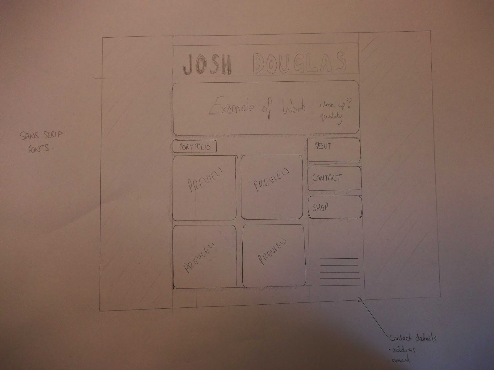
Initial Website Design

Feed Back
Simple but clear layout, easy to navigate and would show of your work without confusion. At the bottom you have contact details but you also have a contact page, do you need both?
Too much going on, on the first page, Nothing really stands out on the page (Hierarchy). The text might get hidden. The preview boxes should be smaller or less on the page. What colours will you use?
I would prefer the images to be straight edged as I don't think the curved edges look as sleek and profesional as they should for a graduates website. The about, contact and shop would look better not boxed up.
I dont personally like rounded boxes it makes it look a bit retro.Previews of work appear a bit too much. Might be better with one central image. Would prefer it without boxes this would make it more clear and legible. Easier to navigate.
I like the layout and how it is centrally focussed. Will the about, contact and shop button be permanent? What choice of font will be clear + bold, eye catching. Like how it showcases work immediately this works well with the 5 second rule. Unsure of the rounded boxes but like the use of grid.
Clear layout which is easy to navigate. Modern fonts are good. Why is the portfolio link separate.
Too many previews of work, may be a bit too much to look at. If the contact details are on every page, why have a separate contact details page?
No comments:
Post a Comment