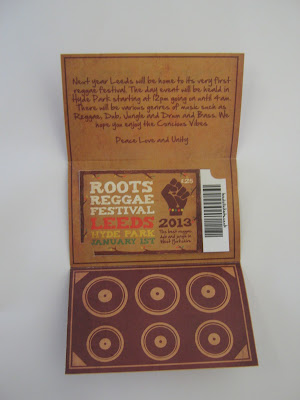
In todays crit we brought in our 3 products which extended on from our History of Brief. I found this session really helpful. I felt allot more comfortable analysing others work in professional manner, it was quite easy to give constructive criticism at this stage in the year. Last year crits were rather daunting but I feel this year is going to be allot easier.
Products
Some main points of feedback that we were receiving wer along the lines of:
- Good Clarity
- Effectiveness of type
- Questions + Discussion
- Relevant Colours
- Originality of format
- Range - does it work
- Relevant Text
- Correct spelling and grammar
- Composition
- Originality of design
What I wanted answering:
- Does the layout work well?
- Does the work read well?
- Is the style of my design appropriate for the subject matter?
- Does the work stand out to you?
- Does it interest you?
- How do you think it could be improved?
- Do you think the type is appropriate for the subject matter?
My Crit Feedback
Strengths
- Works as a set really well, its clearly readable and the colours suit the theme.
- Imagery is chosen well
- The flyer is informative
- Stands out because of the bright colours
- Playfulness that suits reggae music
- Design is consistant and neat.
- The layout works well, Images breakup info.
- Nice flow and structure
- Type is easy to read, appropriate across all products creating interest
- Eye Catching
Improvements
- The type in the flyer could be bigger
- Could of chose a more reasonable type.
- Different Stock would be nice.
- Could of included the roots of the tree with the type.
- Printing on wood could of been nice. Laser cutter?
- Either edit the text or ticket holder or edit ticket to 'get your ticket' or state not a real ticket in the flyer to show its promoting. Get rid of speaker image in the leaflet
- Could of made poster more tree shaped.
I agree with the comments made, all the statements made were things I had already thought about. If I had more time I would of played about more with the designs. It would of been nice to print on nicer stock too. I would like to experiment more with more organic materials. It would of been nice to make a real ticket too with perferate edges.


No comments:
Post a Comment