In todays session we are looking at the processes and techniques that you need to prepare when designing for commercial print, looking at spot colours and process colours.
Working with Indesign
When working in Indesign we would usually set up a new document over a book the majority of the time. Choose the paper size before hand allowing room for trimming. Also take into consideration columns, gutters, margins and bleed if it is relevant to the work you are creating. This gives your work consistency. Bleed is very important, anything that runs to the edge of your document should be extended to give trimming space to allow room for error.
Consider :

- File Format
- Stock
- Bleed - Standard 3mm....
- Colour
- Slug - Used for printers marks / page info, registration. - defines area out side the page that will print. Not commonly used.
- Facing Pages - Is it a book?
- Number of Pages
- Orientation
- Page Size
- Talk to the printers before you finalise everything
- Primary Text Frame - each text frame will be linked together so the text will link from page to page. The frame will always line up with the margins.
Page Layout / Set up
Slug - Blue
Bleed - Red
Pink - Margins
Applying Colour
Create a frame, then using the swatch panel you can choose an appropriate colour.
Works the same as illustrator, you can apply colour to either the fill or stroke values.
Working with Text
The same principle is applied when changing the colour of text. Shortcuts can be used just like in Quark Express to change the size of the text.
You can create colours just like in illustrator, right click on swatch panel and select create new swatch.
Spot colours can be accessed through the Colour Mode drop down menu.
Creating a tint swatch in Indesign
This is really easy in Indesign, all you need to do is select a swatch
Then go to New tint swatch in the drop down menu
Finally adjust to the tint you want, then select add tint.
Preparing Images Before Indesign
When designing for print the preparation of images is very important. You usually do all the editing in Photoshop and Illustrator. Indesign should only be used to arrange the images, not editing!
Photoshop Checklist
Convert Images to CMYK or Grayscale before printing
Resolution - 300 dpi
Size needs to be the actual size. No scaling in Indesign - ruins the resolution - VERY IMPORTANT
Save Format - PSD or TIFF - PSD allows for transparency
Illustrator
File Format - Ai - copy and paste
CMYK
You can scale illustrator artwork in Indesign
Placing Files into Indesign
File > Place
Any spot colours used in the image will be transferred into the swatches pallet
Always keep all the images in the same folder as the Indesign Document.
Links Pannel has information on the Images
This works the same for illustrator images. You can even Copy and Paste
the spot colours will also be added to the swatch panel.
1 Colour Print Job
when using a grayscale TIFF image you can apply colour to it by selecting the image
Click in the central circle which changes the border to brown.
Then choose a colour in the swatch menu to change the ink colour.
If you want to quickly edit the Image from Indesign
Right click on the image then select edit original or hold Alt and double click the image
When editing the image in photoshop
I double clicked the background layer and changed it to layer 0
Using the magic wand tool I deleted the background
Then Saved it as a psd file.
With the altered Image we returned to Indesign then clicked file place
and dropped in the psd file.
Colour Values in Indesign
separations option allows you to see each individual colours.
This process is good for preparing for screen print.
Offset Litho Printing
To print positives for screen print. Select file and print then in the Output option
Change the colour mode to separations. This will Print out Positives
Over Printing - Allows colours to mix on page. This won't knock out the colours behind.
Attributes Window is needed
Ink Limit - This is a big thing in commercial printing. This feature lets you know
where there will be too much ink applied, this is shown by the red area on the image.
This could cause problems when its printed, the stock could rip amongst other problems
Trapping
A “trap” is a method of overlapping abutting colored objects to compensate for the imperfect registration of printing presses. Because registration, even on good presses with good operators, can be off by a quarter point or more, abutting elements in your publication may not end up abutting perfectly when the publication is printed by your commercial printer. What happens then? The paper shows through where you don’t want it to. Do we need to tell you what happens when you take your work to a press that’s badly out of register or run by turkeys? Disaster. Before this happens to you, talk with your commercial printer regarding the tolerances of their presses and/or operators. Don’t ask them if they’re turkeys—it’s considered rude.
MANUAL TRAPPING
If you can’t (or don’t want to) use the automatic trapping methods (In-RIP or built-in) in Adobe® InDesign®, you can still trap your publication—you’ll just have to do it yourself. We describe this process first because we believe that you should know how to add and subtract, multiply and divide before you ever use a calculator.
However, before we start describing manual trapping techniques, we need to state that InDesign’s automatic trapping methods can almost always trap your publications better than you can (assuming that you have both deadlines to meet and a finite amount of patience), and if you use them, you usually won’t even have to think about trapping. Also, many prepress shops prefer to use post-process trapping software; in this case, they’ll want you to leave trapping turned off (it’s off by default). As always, check with your service provider before doing anything rash.
Object-level overprinting. The key to trapping, in InDesign and any other software, is in controlling which objects—or which parts of objects—print on top of other objects as the printing press prints your publication. The only way to make manual trapping work is to control the overprinting characteristics of individual objects (see Figures 1 and 4).
Luckily, you can. Any InDesign path can be specified as an overprinting object (that is, it won’t knock a hole in any objects behind it when you print), regardless of the object’s color. The controls for object-level overprinting are the Overprint Fill and Overprint Stroke options found in the Attributes palette (see Figure 1). These controls, used in combination with InDesign’s Paste Into command, can be used to create virtually any trap.

Figure 1: Attributes palette
We have to stress the importance of the Weight Changes Bounding Box option on the Stroke palette menu. You cannot create traps when this option is turned off, so you’ll have to make sure it’s turned on as you follow any of the procedures in this section. (We don’t usually have this turned on, which is one reason we prefer to use auto trapping rather than manual trapping.)
When you’re working with trapping, you’ll be creating spreads (outlines of objects, in the same color as the object, that are slightly larger than the object itself) and chokes (outlines of the object that are the same color as the underlying object’s color). Spreads make the object larger so that the edges of the object print over the underlying object; chokes make the area knocked out of the underlying object smaller than the outline of the foreground object.
Use chokes when the foreground object is a darker color than the background object; use spreads when the foreground object is lighter. In other words, trap from light colors into darker colors. Sound subjective? It is. We use chokes when we’re trapping type—text characters often look distorted when you use spreads (the eye is very critical when it comes to text). Some folks ask why you don’t just always overprint every color on top of every other color. The answer is that inks are almost never fully opaque, so if you print solid cyan on top of solid magenta, you’ll get purple—probably not the effect you were looking for. With trapping, you’ll still get purple, but only in a tiny stripe along the edge between the cyan and magenta objects.
Overprint preview. InDesign has a powerful feature called Overprint Preview (in the View menu), which gives you an onscreen preview of the strokes and fills that you set to overprint. You may not want to work with Overprint Preview turned on all the time because there is a slight performance hit, but it’s certainly worth leaving it on when trapping, or when zooming in to 2000% or more to see if something is trapping correctly.
Overprinting black. By default, all objects on an InDesign page knock out of all objects behind them—unless they’re black. InDesign, by default, overprints black ink. Most of the time, this is a good thing. To turn off black overprinting, display the General panel of the Preferences dialog box and turn off the Overprint Black option.
Remember, however, that black ink isn’t really fully opaque, even if it looks like it is on screen. Overprinting solid areas of black on an image or other page objects can look mottled, and unfortunately even Overprint Preview won’t display this problem unless you have color management enabled (which we discuss later in this chapter). If you need larger areas of solid black in a full-color document, consider making a rich black, a CMYK black that is made of 100 percent black plus perhaps 25 percent each of cyan, magenta, and yellow.
Solid color trapping. It’s more important to trap abutting color fields in publications when you’re printing using spot colors or areas of single process colors (like where 100 percent cyan text sits on top of 50-percent magenta background) than it is in most process color publications. Usually when you’re working with process colors, you’ll almost always see some ink between abutting objects, so you’re less likely to see paper-colored gaps showing a poor trap.
Knockout without tracking / Knockout with tracking / Overprinting
Comparison of a knock-out with and without trapping, and overprinting for perfect and imperfect registration. Rows are as follows:
1. The cyan (lighter) plate,
2. The magenta (darker) plate,
3. Result with perfect registration (some monitors show slight misalignment), and
4. Result with imperfect registration.
1. The cyan (lighter) plate,
2. The magenta (darker) plate,
3. Result with perfect registration (some monitors show slight misalignment), and
4. Result with imperfect registration.
Trapping Directions
It is important to know that the darker color always keeps its shape. The neutral density of a color is used to determine its darkness.[2]
The lighter color can trap the darker color in the following directions:
The lighter color can trap the darker color in the following directions:
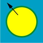
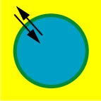
- Choke: The yellow square makes the cyan circle in the middle smaller.
- Spread: The yellow circle becomes bigger.
- Centerline: Both Spread and Choke are applied (rarely used).


No comments:
Post a Comment