We have been the set the task to collect a list of websites that we like and don't like. I will look at the format, the ease of use, how engaging it is the presentation amongst other things. I will identify the pros and cons, and make noted on how they could be improved.
Like
http://www.carnationgroup.com


Carnation Group are a design agency, their website is very interactive and visually exciting
As you scroll down the page you have the option to pan across interfaces. Like above the
arrows can be clicked on to see other recent news. I like how playful the website is, there
are lots of things to interact with.

Although there is quite allot going on, on the site its not too over crowded.
I like the use of the tiles to navigate through the recent works. It allows you to
read a snippet of each case study. They have used quite a complex layout which
makes the website more fun to use.
http://www.soupagency.it/#services


There are a some nice features on this site. I like when you hover over the circles it
reveals the work they have done. Then when you click in it the page makes a transition
to the case study in a smooth stylish way.

I really like the SOUP website. Once again this is for a design agency that cover
quite a range of sectors in the design industry. I really like the simplicity and style
of the site. They have used a bold but simple colour scheme that works really
well to give contrast. The page is interactive too which makes you want to explore
the site further.

There are a some nice features on this site. I like when you hover over the circles it
reveals the work they have done. Then when you click in it the page makes a transition
to the case study in a smooth stylish way.
http://www.equ.com.au/#!/

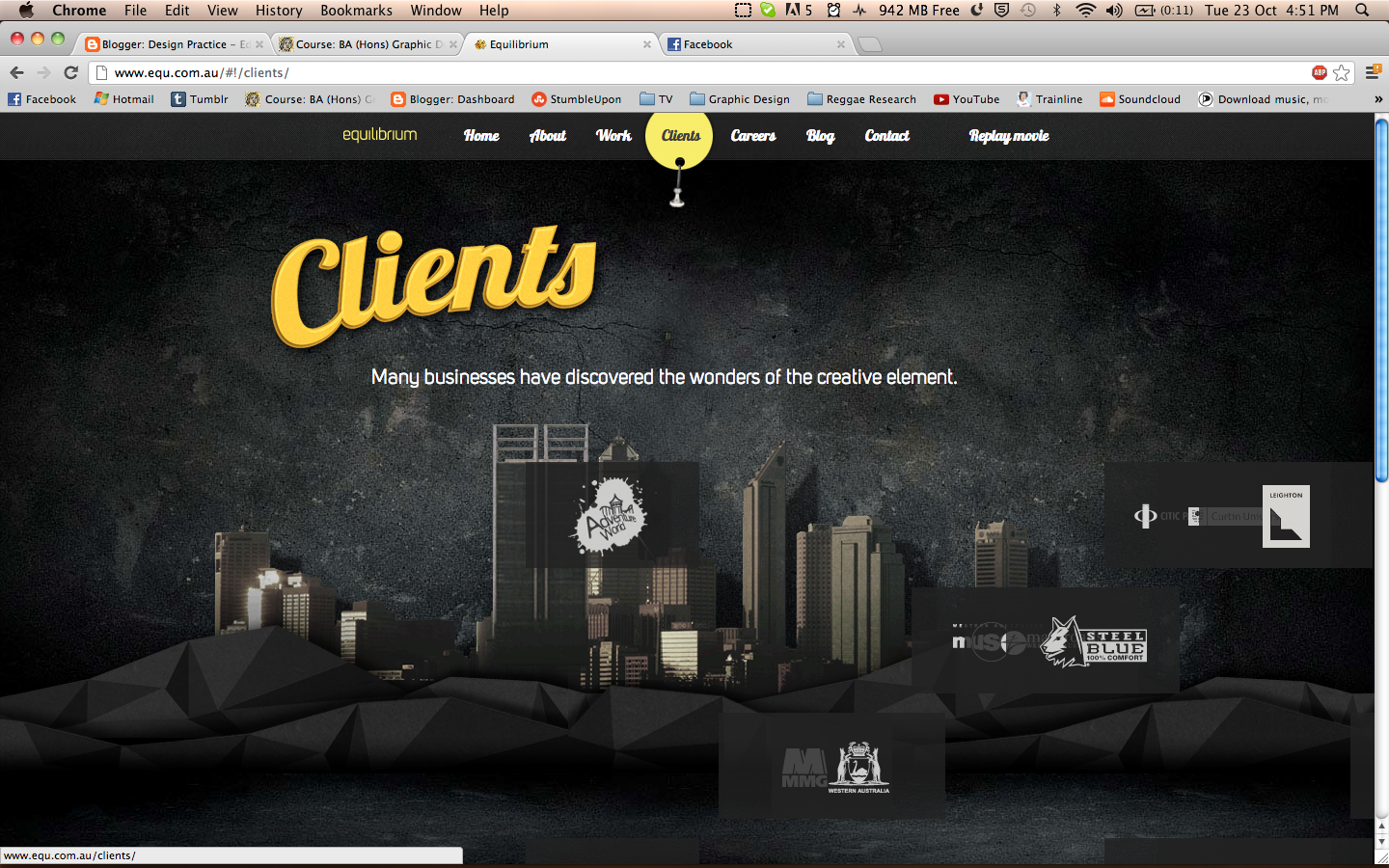
The first thing I like about this website is the introduction. They have created an entertaining
animation that sets the scene for the website. It has been made really well and instantly
creates interest in the company.


The site is really interactive and the background moves also. They have even included
sound effects to go with the site. It is really easy to navigate around too as they have
used a simple layout.

I also like how when you click on a link it doesn't direct you to another page
the page just makes a transition sliding the new information onto the page. Even
the separate icons come flying in which is visually engaging.


The first thing I like about this website is the introduction. They have created an entertaining
animation that sets the scene for the website. It has been made really well and instantly
creates interest in the company.


The site is really interactive and the background moves also. They have even included
sound effects to go with the site. It is really easy to navigate around too as they have
used a simple layout.
I also like how when you click on a link it doesn't direct you to another page
the page just makes a transition sliding the new information onto the page. Even
the separate icons come flying in which is visually engaging.

http://weightshift.com/

Weight Shift are another design agency. I love the simplicity of the website it is structured
well and is easy to navigate. They only have a limited amount of options which makes the site
really easy to understand. They have used a clean crisp layout and colour scheme which makes
the company look smart, modern and stylish.

They have some nice visual material as well like the image above. This is showcasing some
of there work which instantly adds interest. They also have the arrow options either side
which allows you to transition through their work and clients.
http://loulouandtummie.com/

I love the site of Dutch Illustration Duo Lou Lou and Tummie. They use bright bold
colours and interesting textures and patterns. their website is also interactive with moving parts
and flashing lights. I think this makes it more interesting and engaging. They have used a simple
but effective column layout . I like the photo montage that appears on the top of the page too
this immediately shows the view what they are about.

I like how their work is presented in this section its easy to look at and shows
aspects of every illustration. It looks exciting and stands out which is a good aspect
when creating a website that encourages the viewer to keep looking.
Dislike
http://www.5safepoints.com/


There is also some random guarantee that floats around the page for no reason too
this just looks tacky, they have not even cut the shape out as it has a white square border that
sits behind circular shape.

I found this driving school website in America.
This has to be one of the worst websites ever. The page scrolls down for ages for no reason.
The layout is appalling there are random long text boxes half way down . I am really not fond
of the color scheme either. They have used loads of clashing colours and have not really
been very creative with the typography.

There is also some random guarantee that floats around the page for no reason too
this just looks tacky, they have not even cut the shape out as it has a white square border that
sits behind circular shape.
http://ronoslund.com/

I think this says it all. The site is disgusting most of the backgrounds are horrible tiled images
He has used bright text that follows no colour scheme. The links are spread out everywhere and the
majority of them dont work. There is no clear layout and it is also quite hard to understand whats what.

This is an example of one of the worst pages still under construction. The background is hideous for
a start and makes it really difficult to read any text on it. There is also some floating tacky white text
moving from side to side.
http://www.dokimos.org/ajff/

This website looks like sick. It is awful the rainbow background moves across the page
which makes it hard to read anything and will most definitely give you a headache. This acid trip
jesus website is the ugliest thing I have seen. Nothing is clear on the page. It is difficult to
understand what to click on.
http://www.miauk.com/default.aspx

Although the layout of the website isn't majorly terrible, it is let down by the fact
that none of the links work what so ever, which makes the site pretty useless. To improve
the layout I think it needs centering as it looks out of place on the left hand side.

Although the layout of the website isn't majorly terrible, it is let down by the fact
that none of the links work what so ever, which makes the site pretty useless. To improve
the layout I think it needs centering as it looks out of place on the left hand side.
http://www.fabricland.co.uk/

Here is another terribly designed website.They have used loads of tacky GIFS on the site
like the flags and mail box, which just makes the page look cheap. There is far too much going
on and the layout is shocking. There is a really thin menue bar down the side with text in all
sizes. This makes the site allot of effort when your trying to find the right section. The colour
scheme is also really tack and garish.
No comments:
Post a Comment