| BRIEF |
Produce an alphabet based on one of the letter forms you created from the Alphabet Soup, Visual Thinking brief. You are restricted to using black and one colour and it is to be produced in CMYK (cyan, magenta, yellow, key). Although you are restricted to one colour you experiment with opacity and half tones. You should use your research and experience to date as well as your studio based visual investigations as a starting point. You will use Abobe Illustrator as a tool for visual investigation. |
| Background / Considerations |
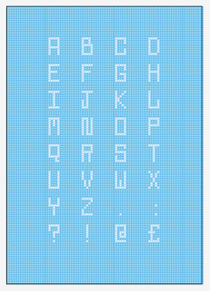
One of the problems with software is that everyone has access to it but not everyone knows how to use it creatively. Abode illustrator is primarily used for the generation of vector-based images and as a type tool. When used as a means for visual investigation it offers the potential for rapid generation of visual variations. The possibilities of which can used as a springboard for further visual research. Think visually. Consider what the visual essence of your subject matter is and how best to communicate it. How can these letterforms that you created be developed further now that you are working digitally? Initial Stages This all stemmed from the series of letter forms I made for the word "POP," I initially scanned them into the computer and brought them into illustrator to pay about with them. Here are my original letter forms.  I started with a kind of pop art / fizzy pop style which moved into a 60s pop font then finally popcorn. Here is what I started in Illustrator 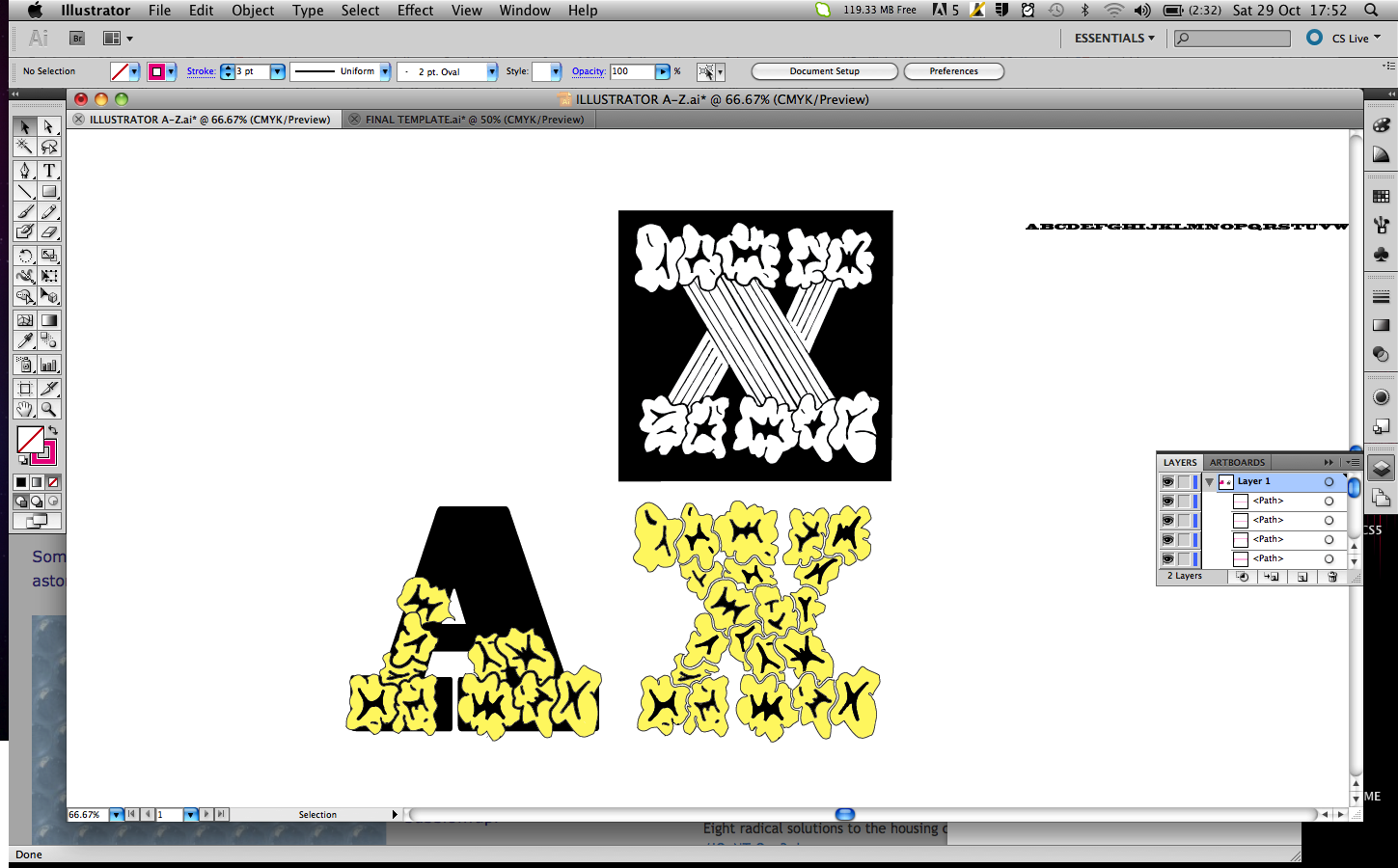 I live traced my letters in and played about with the shapes to slot the popcorn together to make other letter forms.  I wasn't really happy with where this was going so I decided to steer away from this design and concentrate more on the 60s pop font style typography.  Using the rectangle tool and the pen tool I was able to create a 60s pop font based on the existing font Blackoak Std. Certain letters worked well but I was starting to struggle.    I was not happy at all with the fonts I had created so I decided to look at a different aspect of pop, I decided to look at bubble wrap. I found an image of some bubble wrap then copied the pattern. After a long time of duplicating the pattern I was able to cover the entire A1 Sheet in the bubble wrap pattern.  I started to change the colours of bubbles to make letter forms. I quite like the wacky look of the letters, but because of the pattern it was hard to get consistency within the letters, some of them just didnt fit in very well.  The alphabet is starting to take shape here it does'nt look too bad, but I found it so difficult to space the letters evenly that I am unsure about it.  I have decided to take another approach to the font. I decided individual bubbles would make up the letter forms better. But this was too difficult to space each bubble out evenly also.  Here ye can see the individual bubble letters.  I was trying to space the bubbles out evenly and in a more ordered fashion but it just made the letters look really wide and silly.  I changed my idea again and went back to the full bubble wrap sheet. But instead of looking at the generic bubble wrap pattern, I created it in a grid format to make it easier to produce letters. This took the piss once again...very time consuming.  I made each letter 8 bubbles high and 5 wide, I spaced the letters out 10 bubbles apart horizontal and 4 bubbles vertically to create a nice grid for my alphabet to sit in.  Here you can see the finished version on Illustrator, I am happy with the out come I think it works well.  Here is the type up close, I tried to give the bubbles a bit of detail. FINAL DESIGN  Type Face in Practice  I think my type face works well in context. It may be difficult to read from afar but I think it still suits its purpose well. I have tried to make the letters as clear and legible as possible. Final Print   |
Sunday, 30 October 2011
ALPHABET SOUP//ILLUSTRATOR//OUGD403
Subscribe to:
Post Comments (Atom)
No comments:
Post a Comment