Produce designs for a set of three high impact posters that deliver a personal identified message derived from your given proverb. A proverb (from Latin: proverbium) is a simple and concrete saying popularly known and repeated, which expresses a truth, based on common sense or the practical experience of humanity The three posters should work as a set or series and be visually consistent. The first must be produced solely using type, the second solely with image and the third a combination of both type and image. You are restricted to the use of two colours plus stock. |
| Background / Considerations |
|
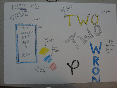
First of all I thought about what could symbolize my proverb. What could represent wrong and right?
- Tick / Cross?
- Thumbs Up / Thumbs Down?
- Happy Face / Sad Face?
- Green / Red?
- Right Turn / Wrong Turn?
- - / +


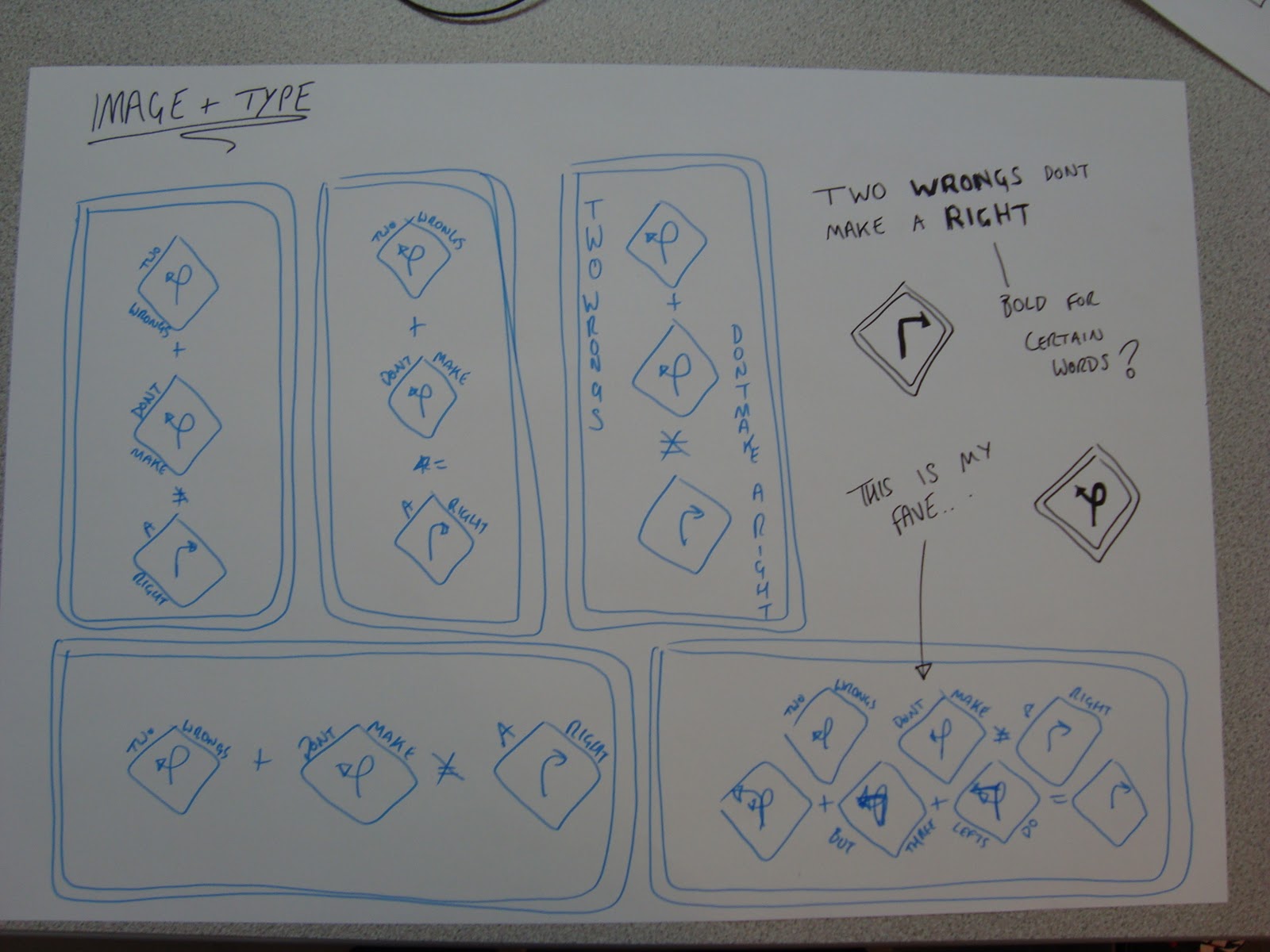
I Tried to come up with a way of representing the wrongs and rights within just text. Here is what I came up with. I made 2 mistakes within each proverb to outline the 2 wrongs. I think this is quite a subtle way of getting the message across.

I kind of changed the proverb a bit. I interpreted "2 wrongs don't make a right" as: if someone does something wrong to you doing something wrong to them doesn't make it right. I decided to add but three lefts do, this was just to give it a bit of humour, the message is still clear but it adds a bit of light heartedness. Also you could interpret the 3 lefts as avoiding doing wrong!


Design Sheets


INITIAL DIGITAL DESIGNS
I started creating digital versions of my ideas on Illustrator, playing about with type and image, Mainly using the text and pen tool. I found the ideas worked well in colour.


I couldn't decide what colours to go for I like the blue as it is easy on the eyes. I thought I could try represent the 2 wrongs and the right by using the red and green having 2/3 red and 1/3 green, But I think this looks a bit tacky.


I also looked at yellow as a possibility as this is the colour of road signs. I thought this would work well but actually it looks a bit ugly, its also a bit cliche so I don't think I will be using this.

I tried different spacings of the signs to see what looks good on the page. Here you can see the signs more spaced out. Although it fills the page it doesn't look right.

I added a border to the image.

I positioned the signs closer together. I think this works better.

Added the X to the =

I started to play with type and image here. I added the proverb to either side of the signs. I think this works rather well.

I think I prefer this layout of the text than the other.
Portrait?
I looked at creating my posters in a portrait layout but I dont think it works as well. Except the just Type poster which I think works better in this layout :/


Here are some of my portrait type and image designs, I'm not keen on the colour, I think I prefer the image on the far left the best. The composition works well.


The colour works well on these posters. However the symbols I added look a bit shitty. I'm not too keen on them, but I was just experimenting. I decided to give the posters texture as it gives them a bit of life. The image on the right has a fabric texture over laid on top of the design.


I added a stained texture but this just makes the image look dirty. I much prefer the fabric overlay, it provides better tones and texture.

I think the yellow works allot better with the fabric texture added to it. It takes away that sickly feeling it gave me before. I still think I prefer the blue but it definitely looks allot better now.

I took away the signs leaving the image to see if this would work but it looks terrible I quite like the idea of making some of the words in Bold though for extra impact. I added a Tyre mark as I thought I would keep with the style of road signs. I feel road signs are easy to take on board as they are designed to be glanced at. I tried to keep my designs quite simple so It could be seen in a similar context to the road sign or bill board?

I decided to play around with the type further. I changed the size and the weight of the text to make it more visually interesting and less dull.

I am happy with this design. It looks interesting and is simple at the same time. I think this will work well on a bill board or road sign. This is somewhere everyone would see it.

I really like this design however it doesnt really fit with my landscape posters. I think this works equally as well as the horizontal one. It was a tough decision dropping this from my final 3.
FINAL DESIGNS?
Here are my final 3 designs. I am quite happy with the outcome, I think the posters work well as a series, they are easy to understand and are also quite eye catching. I wish I had had more time as I was rather rushed this week so I didn't have allot of time for research. I think the colour works well, I have stuck to the guidelines which is always good.
Type + Image

Image

Type

No comments:
Post a Comment