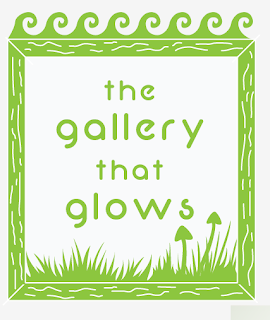
One of the other factors of the exhibition I had to think about was that branding and way finding as this is another important aspect of the whole exhibit. I wanted to try and emphasise what the show is about but also trying to keep with the style of the illustrations etc.
I came up with the name "The Gallery That Glows" I think this quite a catchy name and is simple and to the point. i think it is quite a bold name which sounds interesting and inviting. I used Arial Black to begin with as it was quite bold which would draw people in.
I decided that using a picture frame in the logo was vital as this highlights the format of the exhibition. I wanted to try emphasise the glow by adding the triangles round the edge but I felt this looked wrong.
In the end I switched fonts and decided to use neon 80's as it is essentially like neon light tubing which I thought was relevant and also fit in with the illustrative nature of the work.
At first I was going to get the poster printed out as fluroescent as possible but I have now decided I will laser cut the images out of fluorescent paper as this will give off a brighter glow. I started by just having the text in the frame in a similar illustrative style. I like the black and green contrast but I feel
this doesn't follow the colour scheme.
I experimented with incorporating references
to the land and sea within the logo.
I decided the glow didn't follow the illustration style
Way Finding
I will have laser cut fluorescent wood style signs placed around
college leading to the exhibition.
Snail poster, Unsure
Could be quite interesting, Could draw interest.


No comments:
Post a Comment