Friday, 30 November 2012

YCN LEGO BRIEF

For my Live brief I have decided to go with the Lego brief as this is something I reckon I will thoroughly enjoy. It gives me the chance to get involved with a big part of my child hood again. The brief is quite long, but in summary lego basically want me to create a campaign that distinguishes lego from all its competitors. They want to invent the futre of play.

In freds workshop we ran through an excercise to see if it was worth doing the brief in which we were given 20 odd questions of what we propose to do and why:

Why have I chosen this brief?
Imideiatley I was interested in this brief as I'm a huge fan of lego. I think it would be good to get involved with something I found useful and fun as a child.

What do you want to get out of it?
Creating a campaign is something that I have not done before so this will be a learning experience and it also gives me the opportunity to work in any medium I see fit.

What do you want to do/make?
I am hoping to dig out the lego and show the benefits and also the endless possibilities that lego has to offer. It would be nice to make some kind of gift pack or a stop motion video. It might be nice to work with video as this is something I have not tried doing yet. If i had enough lego I would create some kind of large scale Sculpture or workshop for the kids in town.

What is the problem?
Other rip off lego companies keep popping up that are inferior to lego. This means that if children were to get imitation lego and are disappointed they will associate that with 'LEGO' which could put the child off for ever.

What is it asking you to do about it?
Create a campaign that encourages people to choose LEGO over other imitation building products. Highlight the benefits of lego.

What is it trying to achieve?
Its trying to make the world know lego is the best and most beneficial building toy for children. Its trying to deter parents from buying imitation products.

Why do you want to enter it?
I dont think I will get bored of the brief as its something that interests me, and also the chance to work in any medium gives me the option to experiment and have fun.

What do you have to do?
I need to create a campaign that is porgional and is also apealing to the parents of young children. I need to convince them that lefo is the best toy! to promote its educational values and the other benefits lego has to offer.

What do you need to do?
I need to find out why lego is the best and why children would benefit. I need to sell the product in a way that appeals to the parents.

What can you do?
I can do anything I want aslong as I propose it with good reasoning on why it will benefit the campaign.

What could you do?
I can propose any idea from installations, workshops, mascots, events, advert etc.

What is the message?

  • Lego is the ultimate construction game for children
  • Lego has many beneficial factors for a childs education
  • Lego has sentimental value which no other construction game has
  • Superior Quality
  • Inventing the future of play
Who is the audience?
  • Parents of boys aged 5-10
  • Parents of girls aged 5-10
  • Boys
  • Girls
  • Gift Buyers
What is the context?
  • Playschools
  • Shopping Centers
  • Lego Land
  • Construction workshops
  • Nurseries
What products are associated with it?
  • Cars
  • Trains
  • Toy Box
  • Computers
  • Buildings


10 Most important words on the brief:

  • Parents
  • Heritage
  • Multi-media channels
  • Campaign
  • Functional Benefits
  • Sentimental
  • Inspire
  • Creative

What do you already know?

  • Target Audience
  • Benefits
  • History
What do you need to find out?
  • Past campaigns
  • Ideas
  • Design direction
  • Choice of media
  • Colours
  • Fonts

Thursday, 29 November 2012

FINAL MOUNTAIN TRIKE DESIGN SUBMISSIONS

We sent off two very different trifold leaflet designs to the client based on the research and feedback from the brief in order to give them a choice of different styles.

Design  1


Design 2


Feedback

The client had already selected a BrandFuel leaflet design previous to our collaborating on this brief, however, we sent off our final two designs to them anyway and received this feedback:

The alternative designs you sent are exactly the kind of thing that I wanted!  Havent sent it to the rest of the team yet, but I think they are really good and really capture the essence ofMountain Trike!

Mountain Trike, the client, ended up selecting one of our designs (design #2) instead to be printed for their new leaflet over the BrandFuel original designs! It was very exciting to know that our work was favoured over a professional design team and would 
be professionally printed.

We received this email (sent to BrandFuel, Emily & I) from the client once the designs were finalised:


I just wanted to drop a quick note to you and your team to say a massive THANK YOU for all your time, energy and patience (!) that you dedicated to our new Mountain Trike leaflet.

The result is great and we are as I type waiting for the printed version to be delivered which I will, of course, send on some copies to you all.

The team here at Mountain Trike very much appreciate all the work you have done and we are sure this leaflet will help strengthen our brand and be a great marketing tool to use when approaching customers.  We have an exhibition next week - The Motability Roadshow in Peterborough so it will be a great opportunity to launch the new leaflet.

Wednesday, 28 November 2012

DESIGN FOR PRINT - ISSU COPY

Final Digital Version

I am happy with the way the book has turned out. I have tried to experiment with different layouts through out
but have kept to the grid. I think I have created an interesting book with information on many aspects of print from start to finish. As I have created some of the pages by hand I had to photograph them and mock them into the digital version. I think the colour scheme works well and sticks with the whole PRINT theme. I have tried not to stray with the colour scheme too much. I will be producing a physical version this week, I will hopefully emboss the cover and it will all go in a case I have made for it.

Web Design Workshop 4 - Simon

Domain name websites

One.com
www.123-reg.co.uk

Online Content Management System

cushycms.com

Tuesday, 27 November 2012

Web Design Final Crit

In todays crit session we looked at our mock up home pages for our history of brief. I found this session really helpful overall. I was sceptical at first as I wasn't overly happy with my design or how easy it is to create and navigate. I came up with a few ideas and played about with the textures to kind of create a natural earthy feel. I definitely have some work to do improving the visual qualities I feel as this looks a bit childish and a bit too in your face I think.

 I am quite happy with the layout but I need I dont think it looks makeshift enough.
 I think the border spoils the layout a bit.
I added a texture to the image and also a reggae border round the circle which
I feel represents the theme slightly better.
Roll over Images
 Wire Frame - I just worked out the pixels for each aspect of the design.
 Although the colours are relevant I think it looks too childish to be honest

Crit Feed Back

Strengths

Background looks great
History and Artists are good Icons
Strong concept for website with a clear audience.
Icons music and Festivals work well.
Navigation seems well organised and useable.
Information proposed on the site would be useful to the audience to educate and inform them.


Areas for Improvement

The style of the website is slightly childish at the moment in terms of the bright colours, circles + icons, which slightly contradicts the primary audience who would take an interest in the music.
Music buttons looks too much like itunes - needs changing
Gradients make it look a bit tackier - push the wood texture theme.
Music and festival Icons need to be clearer.
Icons need to be more specific.
Type face for icons are too condensed. Consider alternative text.
Need to keep the consistency of the website even.
Need some kind of introduction and information about the site
What is it for? Who's it for? Why?
What is the purpose of the circle will it be repeated throughout the site?

Action Plan

I need to sort out by buttons, change the symbols and change the font used.
Also edit the gradients on the icons, need to play about and see what works.
I also want to try and get more wooden textures involved as it does like a bit childish.
I want to add some shadows and different tones to make the icons stand out and look less tacky.
I need to plan out the other pages and work out how to add a music player to the site.

Saturday, 24 November 2012

REGGAE SITE - FINAL IDEAS

After the Crit I sat down and drew up the final version of how I wanted my site to look. I decided that the information would change only in the middle section of every page. So I had to figure out how I could display the information well in this circula format. I am mainly going to keep the colour scheme quite natural and woody. This conveys the message behind reggae music I feel. All about sticking to the roots. I hope to have some roll over features on the buttons also.


This is how the home page will look. It will have the reggae family tree in the middle
which will also be a roll over Image. The for buttons in the corners will link to different pages


Above you can see how the information will be laid out on each separate page.
You can also see the roll over features too in the right hand bottom corner.
As I will be making my website out of 9 separate Jpegs it will be easier to code 
if I only have to change the middle square each time.


PRINT BOOK DEVELOPMENT

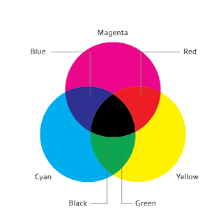
For my Print book I decided to go with the obvious CMYK colour scheme. Although the colours are quite in your face, I think this helps to label and categorize the sections and make the book more readable. I started with the grid, I split it up into 12 columns leaving a large margin of the left hand side, this will allow the screws to fit into the book without going through the content as it will be perfect bound. I wanted to use lots of columns in order to 
keep everything neat and structured. I kept this consistant through out.
 Introduction


Using my design sheets as a guideline I mocked up each page in Indesign
placing image and text boxes ready to fill out.


Contents Page


Swatch Palette - I mainly stuck to the main print colours - CMYK. I also used
RGB and also some pantone spot colours. I tried to keep it quite limited so 
the theme will run throughout.


For each section I created a chapter page to split the book up.
I used the CMY colours for each chapter.

I experimented with many different layouts throughout the booklet to try and get some
variation and also to help increase my layout skills. I found this booklet has really helped
to try new things and styles.


I also labeled each section on the edge of each page to make it easier to
navigate through the book whilst flicking through. 


I tried to look at as much useful techniques as I could. I ended up narrowing the
book down in the end as I thought I had far too much content.


I looked at different paper sizes etc, and recreated all the diagrams in Illustrator.


Chapter 2 - Colour


I decided to try something different here and changed my grid, angling it.


Using Photoshop I edited photos to change them to greyscale using
the channels pannel to split them up.


I also looked at the different printing methods available and illustrated how they work. 


I also looked at printing methods I could do in college. I created 5 hand made pages to 
go in the book, I experimented with screen printing, foiling, embossing, debossing and laser cutting.

Diagrams

In order to illustrate the different printing processes I drew up diagrams of the various processes in illustrator.


 Paper Sizes ( A & B )
Printing Area 
Colour Model - RGB

Colour Model CMYK


Print Order - Mocked up in photoshop.
 Rotogravure
Offset Lithography


Felxography

MOCK UP


I mocked up the book to see what it will look like printed out and to get an idea
of the type sizes etc. This will help me to alter any mistakes.


Book Mock-up 

PRINT PROCESS EXPERIMENTATION


This is my screen printed example page


Foiled Example


Items will be trimmed down and used in the book.


Using the laser cutter I cut out my desired letters and shaped then using the Guttenburg press
I was able to Emboss and De-boss a few pages. I needed to experiment a few times to work
out how much pressure to give it.


I also laser cut some paper to show how fine a quality it can cut to.


I used the same process as before to emboss this page

Wednesday, 21 November 2012

MOUNTAIN TRIKE CONCEPT IDEAS


In order to make sure Emily and I were going down the right root we decided to research some different design styles which we thought Mountain Trikes image needed. From here we produced work which had taken inspiration from various extreme sports magazines etc, as we wanted to make the productmore about the fun and outdoors as apposed to a boring product spec leaflet. We mocked up some concept board to send off to Brandfuel in order to get feedback on what works and what doesn't. We didn't want to waste time going straight into our final designs so we thought this was the best option to start with.

We took inspiration from various downhill bike magazines etc.
In order to make the product look more fun and exciting. We needed to
emphasize its off road all terrain aspect of the product.


We put together a series of rough layout ideas using the photos supplied to communicate a range of different ideas so that when go into the final design, we know which style is the most preferred/appropriate, experimenting with fonts, shapes and colours also.


We experimented with tyre marks to emphasize the off road aspect.

We also included some graphics and geometric shapes inspired from some of our visual research. We wanted to make the leaflet design more up to date and modern, so we
used bright colours  and bold big shapes to do so.


We created rough mock ups of how we could display information and imagery in a fun
and eye catching way. We also experimented with logo placement and text.

The images and content that mountain trike wanted to include were not exactly exciting or sold the product, in order to try and give the product more life we used a variety of different methods to try brighten things up, mainly using bright colours and reference to imagery in our primary research.

Circles and tyre tracks
Lines and large images

Photo Selection


As we were sent lots of images to work with it was important that we narrowed it down to the ones that we thought promoted the product the most and ones which highlight the capabilities of Mountain Trike whilst also taking into consideration Brandfuels Feedback.


BrandFuel feedback e-mail RE concepts:

Thanks for sending through your concepts.
We really like what you have done and how it has been presented.
You’ve had a good thought about concepts, design elements, font and colour palette before moving along with the designs.

I’ve reviewed with David; here is our feedback:

What works:
- Good choice of reference material
- Page 3 – we like the treatment of font on ‘take yourself further’, the grittiness suits 
the product
- Page 4/8 – trace of tyre is a good graphical element and will work as a divider between images; try to combine to something in between both graphics
- We really love the sun/wheel graphic on page six
- Nice flow of elements on page 7 but try not to use one graphical element (circles in this case) too much, there needs to be a balance
- On page 7 also like the treatment of ‘Mountain trike’ in top right corner
- Page 10 – we really like the graph-like graphic on the left/middle
 - All colour palettes work well, also good choice of fonts

What doesn’t work:
- Page 7 bottom left – a brochure like this will sit in a brochure holder, so only the top part will be visible – ‘Take yourself further’ could mean anything. Branding MUST be on top as in design in top right corner
- Page 9 – too busy, stripy circles don’t work
- Page 10 right side design are too blocky and static

Could you please, based on this feedback, progress to next stage and develop two designs further.