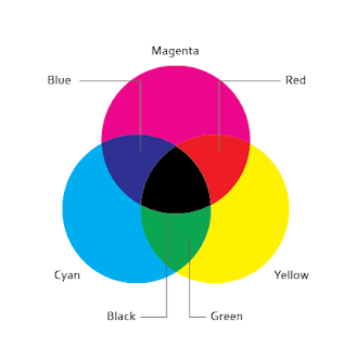
For my Print book I decided to go with the obvious CMYK colour scheme. Although the colours are quite in your face, I think this helps to label and categorize the sections and make the book more readable. I started with the grid, I split it up into 12 columns leaving a large margin of the left hand side, this will allow the screws to fit into the book without going through the content as it will be perfect bound. I wanted to use lots of columns in order to
keep everything neat and structured. I kept this consistant through out.
Introduction
Using my design sheets as a guideline I mocked up each page in Indesign
placing image and text boxes ready to fill out.
Contents Page
Swatch Palette - I mainly stuck to the main print colours - CMYK. I also used
RGB and also some pantone spot colours. I tried to keep it quite limited so
the theme will run throughout.
For each section I created a chapter page to split the book up.
I used the CMY colours for each chapter.
I experimented with many different layouts throughout the booklet to try and get some
variation and also to help increase my layout skills. I found this booklet has really helped
to try new things and styles.
I also labeled each section on the edge of each page to make it easier to
navigate through the book whilst flicking through.
I tried to look at as much useful techniques as I could. I ended up narrowing the
book down in the end as I thought I had far too much content.
I looked at different paper sizes etc, and recreated all the diagrams in Illustrator.
Chapter 2 - Colour
I decided to try something different here and changed my grid, angling it.
Using Photoshop I edited photos to change them to greyscale using
the channels pannel to split them up.
I also looked at the different printing methods available and illustrated how they work.
I also looked at printing methods I could do in college. I created 5 hand made pages to
go in the book, I experimented with screen printing, foiling, embossing, debossing and laser cutting.
Diagrams
Diagrams
In order to illustrate the different printing processes I drew up diagrams of the various processes in illustrator.
Paper Sizes ( A & B )
Printing Area
Colour Model - RGB

Colour Model CMYK
Print Order - Mocked up in photoshop.
Rotogravure
Offset Lithography
Felxography
MOCK UP
I mocked up the book to see what it will look like printed out and to get an idea
of the type sizes etc. This will help me to alter any mistakes.
Book Mock-up
PRINT PROCESS EXPERIMENTATION
PRINT PROCESS EXPERIMENTATION
This is my screen printed example page
Foiled Example
Items will be trimmed down and used in the book.
Using the laser cutter I cut out my desired letters and shaped then using the Guttenburg press
I was able to Emboss and De-boss a few pages. I needed to experiment a few times to work
out how much pressure to give it.
I also laser cut some paper to show how fine a quality it can cut to.
I used the same process as before to emboss this page


No comments:
Post a Comment