Monday, 27 February 2012

COMMUNICATION IS A VIRUS // GET PEOPLE TO TRY SOMETHING NEW

'Get people to try something new'

We are required to produce a graphic response that engages with a specific audience (current students in Leeds, or newcomers). 
Originally we were going to look at arts and crafts but after a group decision we decided to change our plan.
The concept is to get people to listen to new/different types of music. Hopefully it will educate them too about the genres and provide help if they are looking for more information.

Here are some images of the brain storm we produced about the concept and the methods of delivery.


We hope to produce some sort of pack that informs and educates the Leeds students. We are thinking about some kind of interactive poster or hand outs. We will discuss this tomorrow in class however.

Thursday, 23 February 2012

POSTER // APRIL SHOWERS BRINGS THE FLOWERS

For my final poster I decided to look at the benefits of rain and nature.
I found a quote online that says "April showers brings the flowers"
I thought this was quite a nice little saying so I decided to base my poster on this.
 I created the clouds and type to start with, I tried to keep it as simple and possible
so it worked with the other posters. I definitely prefer the one with the cream sky
 As I already had a blue sky one I decided against it.
I found a floral font to see if it worked but I don't think it works.
 I played about with filigree patterns which I think looks quite
nice, and also fits in with my rain poster
 I tried incorporating the Blanch font again, which does work
but I want something a little different
 I found another font which is quite playful. As I had used red in the other posters
I thought it would be a good idea to Colour the flowers, but I think
it doesn't actually work that well.
 I decided to take the flowers from the type and add it to the 
filigree plant patterns
Finally I changed the colour of the flowers to a darker red and added
a darker blue back drop to the type and bush to give it some definition

POSTER // RAINBOW

Another attractive aspect of rain is what comes with it. You have to
cherish them lovely days we are fortunate enough to see rainbows.
I have created a Poster on Illustrator using type as a focal point.

 I started by creating my type using the Blanch font.
 I wanted to turn the N's into rainbows. I created a circles the same shape 
as the letter so that it wouldn't look out of place and would be the same thickness
 Using the paint tool I filled in the rain bow
 I added clouds to break the page up
 Originally I was going to change all the N's but
after seeings this I decided against it
 Adding a few rain drops gave colour to the image
I added a back drop on the font to make it stand out more.
Finally I decided to make the 2nd No bigger, this works allot better I think

Wednesday, 22 February 2012

RAIN POSTER // ILLUSTRATOR

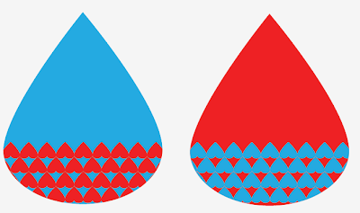
I have been playing round with different shapes and patterns today on Illustrator. I have tried to stick to a simple colour scheme and have experimented with type to try and create something with a professional feel to it. Here are the stages of my Design. Firstly I just messed about with rain drop playing with shapes and patterns.


I decided the blues were too bold in this image
so decided to go for something more subtle
 By mirroring this floral pattern it has made the shape
of some sort of animal maybe a lion. Not intentional
but still looks sweet

 Type Experimenting
  I don't think the slanted text works

POSTER BRIEF RAIN IDEAS

I have been researching online the benefits of rain in the UK. I myself love the rain especially when you can smell it in the air. I have been messing about on Illustrator playing with shapes making patterns to see what works well. I wanted to try express the love of rain. He is just a starting point to be going with. I have  fair few Ideas at the moment, but I just need to concentrate on making sure they work in series.


 I think the pattern works best spaced out to be honest.


Monday, 20 February 2012

DESIGN IS ABOUT DOING // POSTER BRIEF

For Starters...

For the latest brief I was given a quote from Erik Kessels which is 'It always rains in your country". I have to create 3 posters that explain to visitors to the UK why so much rain is attractive. To start with I brainstormed some ideas and imagery that I could possibly use. I need to create something that people from outside the UK will understand.


 Music inspired by Rain?

Wednesday, 15 February 2012

CONTRAST OF EXTENSION PANTONE EXPERIMENTS

Also known as the Contrast of Proportion. The contrast is 
formed by assigning proportional field sizes in relation 
to the visual weight of a color.

I created various contrasts of extension 
using different coloured card