After my crit I went away and changed the colour scheme in order to make it easier to screen print. I got rid of the orange/yellow and just went with red and white. Once I had prepared all my screens I started printing. To start with I printed my place mats.
I realised afterwards that I had used a small screen which made it had to print.
The first lot were unsuccesful and I chose the wrong colour completely turning the mats pink.
I set up my screens on the bed - next time I will use bigger screens
in order to make printing easier.
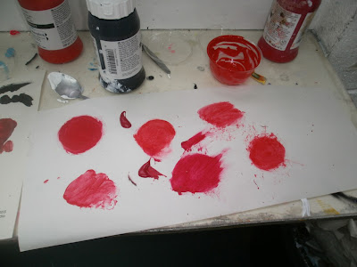
I mixed different paints to try get the perfect colour.
In order to double side print I had to draw the registration marks on
the opposite side with a light box.
After a full day in the print workshop I spent the evening
cutting everything down to size.
The only problem I had was with the beer mats, I hadn't prepared the
document correctly so the registration didn't line up, but this worked
out in my favour. When I such them together it increased the thickness
to that of an actual beer mat anyway.
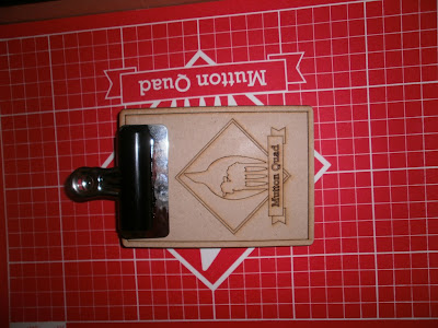
Letter press draw - debating wether to paint or varnish.
Products all together - I need to add ribbon underneath to make
it easier to get the products out.
Smooth easy slide draw
Receipt / Order Pad
Business Cards
Menu
I am extremely happy with the outcome of the products. They are very high quality prints with little errors. The products look much more profesional like this. The colours are consistant and you the blemishes from the screen printing add to the quality and represent the strong authentic print methods that the restaurant represents.
I used quite thick water colour stock which meant all the prints stayed flat. There are few additions I need to make to the set to make it perfect.


No comments:
Post a Comment