In order to get an idea of how local restaurants have been branded. I had a walk round leeds collecting menu's and taking photo's of the interior and exterior. This helped me to understand what kind of image the restaurants were going for. You could see how the theme ran through out with certain restaurants.
Obm Restaurant
Exterior : Low end - Family fun - bold colour
Menu
Take away style menu, low end buffet. Bright colours - family friendly.
Images of food on menu
Milo
Exterior : Quite an arty feel, Student audience
Interior : cosy, hand painted walls, friendly environment
Menu
Square format menu - 1 colour print, looks quite modern
Illustrative menu - quite trendy
Reds
Exterior : Friendly family image. Typeface is big and bold - Meaty vibe
Menu
Nice logo on front page : food bibleish
Simple 2 colour menu, Very typography based
Friendly family feel
Nandos
Family feel, big windows shows off the environment
Menu
Large format fold out menu. - Lots of use of colour
Artist nandos cover - family feel
Take away menu as well
1871 Bar & Lounge
looks like a furniture shop serif typeface
interior was quite trendy
Menu
Menu didn't really correspond with the exterior. Comic Book style menu
Student audience . Bold bright colours.
Comic bubbles
Bella Italia
Exterior : Inviting exterior seating area - family restaurant. Serif typeface
Menu
Hand drawn menu - looks family friendly
Simple layout - large format
Separate lunch menu - A5 format
Separate evening menu - A5 format
Jamies Italian
Authentic Exterior - gold trimmings, looks quite posh - family vibe.
Menu in gold framed box - looks smart
Menu
Large A3ish double sided menu - looks like a screen print but not.
Looks quite up to date and trendy. 2 colours used. Experimented with typography
Family high end environment.
Arty Menu back and front - Branding is consistant
Separate fold out take away menu
La Tasca
Looks quite smart - black exterior. The upstairs lets the building down.
Italian Arty photographed cover, Looks very familyish
Menu is in an A3 format. Simple use of colours
looks smart, quite high end.
Wine menu similar layout but folded
Piccolino
Looks high end, smart simple. Serif Typeface.
Menu
Very modern - Simple clean cut 1 colour.
Looks very smart and High End
Serif typefaces used. Nice quality stock
Xmas Menu was in a smaller format but was printed to a higher quality.
Use of metalic silver ink.
Black white and silver throughout
Here you can see the quality of the printing
The Slug & Lettuce
Has quite a smart image, but logo and name suggests its not that serious.
Simple 2 colour scheme.
Gaucho
Looks very smart and high end. - Exclusive.
Sans serif bold logo.
Menu
Smart metal menu covers with leather string - representing the steak house.
Leather toggle
The menu itself is very simple and modernist. Just black used on white stock,
Interior
Cow skin heavy - The interior design represents the steak house well.
Constant theme throughout - Strong brand image.
Very posh interior
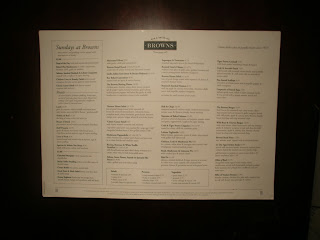
Browns
Looks smart from the outside - Very grand appearance.
Posh interior looks authentic.
Menu
The menu is quite traditional, 2 colours plus
a red for the logo. Thick good quality stock.
Wine menu is much more photography
based. Allot more use of colour.
Small Format still looks quite high end.


No comments:
Post a Comment