With this brief we have to find 3x Newspapers, 3x Posters and 3x Magazines. it states '...Based
on the principles, terminology and information introduced in Session 3
of the Module develop a body of work that demonstrates an investigation
of Typographic Hierarchies across a range of selected Graphic Design
formats...'
I have organized each example of type Hierarchy in terms of Scale, Weight and Importance of Information.
Newspapers x3


The Daily Mirror // The Independent // The Guardian
Magazines x 3


Emel the Muslim Lifestyle Magazine // Architecture Today // Top Gear Magazine
Posters x 3


Time to change (Mental Health) // Propaganda // Students Union Mosaic Cafe
Newspapers
The Daily Mirror = Bad
Although the Daily mirror is quite eye catching I found that the information that was most legible was in fact not the most important. They use lots of different type faces at loads of different sizes which can be quite confusing for the viewer. You don't always know where to look on the page or which bit to read first. I found the Mirror had allot of adverts as well which took focus away from the actual articles.
Scale

Generally the article titles are the largest examples
of type on the page.
Weight

I found allot of the adverts type had greater weight to them.
Importance

I found some of the most important information was the smallest
they seem to make the adverts bigger and more inviting.
The Guardian = Average
I quite like the layout of The Guardian, it is easily read as it has a simple column grid format. The headings are not overly big so they are still not quite as eye catching as the Mirror. I like the use of white space with this newspaper as it breaks the page up reducing clutter. It only uses a limited amount of typefaces which is less confusing for the viewer.
Scale

I found the sizes did not vary too much. They were all
quite easy to read with nothing too fancy.
Weight

Moderate use of bold type
Importance

Generally the most important information
was large or bold.
The Independent = Good
I like the layout of the Guardian. It is easy to read and very clear
the grid format lets you know exactly what to read first. The strict columns
help readability and also bold coloured quotes help to identify key information.
I also like how there is plenty of white space. The page is broken up nicely.
Scale

The header is the biggest here. Generally the important information
is bold or quite large.
Weight

Bold used appropriately
Importance

The important information is either bold or large.
Magazines
Architecture Today = Bad
Although I really like the layout of the magazine the readability is terrible.
There is no clear header you are not really drawn in by it
There is random brands and bits of text dotted about all over the place which
makes it quite difficult to read. The important things are quite small and the most obvious
text is mainly branding.
Scale

Weight

Importance

Top Gear = Average
The readability of Top Gear magazine is fairly good.
The columns make it easy for the user to read. Its laid out
quite nicely on the page too with good use of imagery. Generally the
important information is in Bold or is fairly large which is nice
touch.
Scale

Weight

Importance

Emel Muslim Lifestyle = Good
I like the layout of Muslim Lifestyle magazine. The type is quite
experimental and they have used an interesting grid format. I really like how they
have inserted a quote right in the middle of the columns in bold.
This definitely draws you in onto a key bit of information. The header is bold and eye catching
which is a good thing. The large S increases the readability letting the viewer know
where to start reading.
Scale

Weight

Importance

Posters
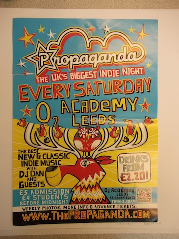
Propaganda = Bad
Although I do really like the illustration style of
the propaganda poster I think it reads quite badly. It is very eye catching but has far too much type on it,
it is very confusing and is hard to read. There is so much going on you don't really know
which bit to read first. Every bit of type is different which makes its a bit confusing
some of the key information is quite small I found.
Scale

Weight

Importance

Students Union = Average
I don't really like The union poster to be honest but it does read
quite well. All the information is laid out in a line and generally the important information
is the largest and easiest to read.
Scale

Weight

Importance

Health Poster = Good
I think this health poster reads best. It has a large heading that draws you in
it doesn't have too many different fonts either which makes it a bit easier to read
the important information isn't necessarily the biggest but it is
clear which bits you should read. The least important information
is right at the bottom and fairly small. I like the use of space on this poster
too as this breaks the page up a little and is not as overwhelming.
Scale

Weight

Importance

No comments:
Post a Comment