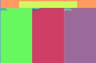
Center Align the Website
In style sheet we need to apply the code to the entire container.
Half the width of the browser in margin-left option
We need to create a template to do this we go to the design view
Then clicked on the column we want. Using the Template objects in the Insert menu
we chose editable regions. As it placed it in the wrong column.
We needed to use command and Z
then in the index sheet we added the correct template after each column code.
Next we saved the Template and changed the name to template it is important to change this from index.
Once we had done this is delete the index.html file From the user work file
We then opened up our template and re-saved it 5 times to get all our separate pages.
How the Websites Work
.DWT <----- Dreamweaver Template
I
I
V
INDEX.HTML
I
I
V
________________________
I I I
HTML HTML HTML
I___________I___________I
Resizing Images for Web
We need to open up the photos in Photoshop
We changed the resolution to 72PPI
we also changed the width to 340px as this sits in the column width.
Next up we clicked save for WEB
Using the 4 up menu we can look at all the different file types and there load speed
Using the menu on the images we can change the download speed. Generally use 1mb per sec
When saving the images makes sure you consider the photo
Jpeg - anything with a solid background - change quality to 50%
Png - Transparent background
We clicked on the column we wanted then clicked insert image.
Alternate Text - This is to make sure everybody can access and understand the website. Partially sighted people will be able to hover over the image and it will read out what it is.
Creating the Buttons
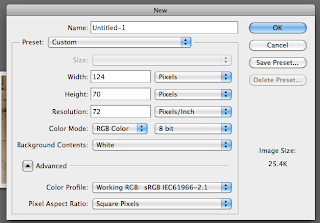
In photoshop we opened a new document and made the document size, the size of the button : 124px x 70px
If you want gradient on the buttons do this in Photoshop not CSS. Just block colour in CSS.
Firstly we made sure our buttons were the right size and resolution and in the correct colour mode
Then we created 2 layers the origonal and the roll over image
We inserted the correct text
When saving for web I chose PNG as it has a transparent background
To insert this into the navigation on the design view click
then navigation then insert image object - Rollover Image
We need to make sure we link everything to the correct page
To make sure the buttons don't slip onto the lower level we could create div's for each button
rather than 1 navigation bar.


No comments:
Post a Comment