Brief
You have developed a message/opinion in response to the previous brief.
Produce a mail shot that distributes, disseminates and reinforces your message to an appropriate list of recipients. Your resolution should fit within the envelope provided* and be accompanied by a visually appropriate mailing list. You should consider the relation ship between the outside/inside of the envelope and its contents.
The tone (occupation selected from the randomiser) of voice should be appropriate to your message, the context in which it is intended to be read and the audience to whom your work will be delivered.
Background / Considerations
What do you want to say and how do you want to say it? What language would be appropriate?
What visual languages exist that relate to your message and how can you use them.
Is the content communicated primarily through type or image? If it is both what is the relationship between the two?
What does the mail shot aim to achieve. Does it direct you to a website, encourage you to attend an event, is it interactive or is it self-contained.
For Starters...
I was given the proffesion of a butcher, so initially I brainstormed things I thought were asociated with a butcher. There was all the common things like a cleaver, meat knives etc. I also looked at how I could link these things with my proverb.
Butcher Style Icons
Here I looked at how I could convey from proverb using Imagery, I looked at cheap battery farmed meat and the fact that the animal conditions are poor and so is the quality of meat, and just because its Cheap does not make it Right.
I looked at ways I could play with type to convey my message. I thought initially to look at big bold text but through research I have learnt that butchers generally use a combination of script, serif and sans serif fonts so I wanted to include some of these aspects. I also went to the butchers in Morrisons and acquired a few stickers. I found they used reds and yellows mainly.
Here is a net design I came up with, hopefully the mail shot should fold out into this net. This will give the consumer the chance to engage with the mailer hopefully making the message stronger.
From here I looked at how I could link my proverb, "Two wrongs don't make a right." I started to think about fast food restaurants, and how the meat is horrible but cheap, and the food is terrible for you. I didn't think this was the right path to go down so I decided to concentrate on the topic of battery farming, and how butchers meat is allot better for you, also more ethical than battery farmed meat. I thought I could translate the proverb as so:
Two Wrongs Don't Make a Right :
Poor Animal Conditions + Poor Quality Meat = Just because it's cheap doesn't make it right!
Net Designs
I played about making different net designs to see what I thought would work well, I decided to go with the box design as this will be fun and engaging for the audience.
Illustrator Designs
From my research an initial ideas I decided I would create a mailshot that folded out into a net of a battery farm cage full of chickens, I thought this was a good way of getting the target audience involved with the message I am trying to convey. This creates a link with the audience which I feel will make the message stronger. Here are my initial illustrator designs and font choices:
I looked at possible fonts I could use to represent my profession as a butcher, from my research I found that fonts like the above are used commonly among butchers.
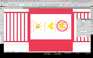
I started creating a net as basis sticking to the mailshot dimensions
I created some chickens to start with and chose a yellow colour
I decided to use white card as my stock as I had already chosen yellow and red as my 2 colours. The white stock works well with the butchers theme.
I reproduced the chickens over and over to show the battery farmed cage
I designed a NO BATTERY FARMING SIGN
Here are a set of symbols I created to visually represent my Message
Colour Testing
For one of the sides I played about with type to convey my proverb
Final Net Design
Outside
Inside
Top
Back
Mailing List
Mailing List
I decided to mail my mailshot out to schools in the local area, this is aimed to lunch providers urging them to purchase fresh butchers meat, over battery farmed produce to cut costs. Hopefully my mailer will convey the right message and also will be a fun mailer to interact with if passed onto the students.
Final Stages
As my mailer was double sided, it was a bit of pain to print accurately. My first attempt showed the net did not match up on both sides. So I reduced the inside leaving just the chickens, as the other details were a problem to print. I chose white card as stock. Once I had got them all printed I took my work to the lazer cutter:
I initially cut out a test piece to check the lazers alignment
I came across a problem when cutting the net. It was too difficult to align the paper up perfectly, so when it came to cutting it, it was slightly off. So I had to cut it the long way, in sections at a time.
Making the Box
The mailer folded up
Final Product
Overall I am quite happy with the mailshot, I think it has turned out well. If I were to do it again I would try to come up with a better way of sealing the envelope as I feel the slit for the tab may affect the box when built. I would of also made the bars bigger and used less of them, as this makes the box delicate which is not a good thing. I would also improve on the net too as the tabs are too big, I shouldn't of put bars right to the edge.
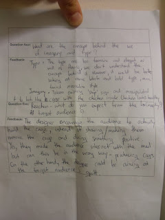
Feed Back
From my feedback I feel Tanida & Steph didn't really understand my work. I agree with some of the comments made for instants the craftsmen ship, If I were to do it again I would definitely make it easier for myself to produce something that looks a bit more professional. They also thought my font was too feminine, but as my research showed script fonts are commonly used. I don't know that the mailshot was aimed at school lunch providers not children which I could of made clearer. But apart from that they liked the design there are just a few tweaks I could make, I feel the script font is a bit too illegible. But all in all I am happy with the outcome.


No comments:
Post a Comment