The Basic Principles of Colour
Colour and Colour theory represents one of the fundamental principles of Graphic Design and Visual Literacy. This site inntroduces some ot the key terms that a designer needs to be aware of when starting to analyse the use of colour and understand the theories and practices involved when discussing colour.
Additive & Subtractive Colour
Televisions, cameras, scanners and computer monitors are based on the additive system of color (RGB), where red, green and blue light projected together yield white. Offset printing, digital printing, paints, plastics, fabric and photographic prints are based on the subtractive system of color (CMY/CMYK) in which cyan, magenta and yellow mix to form black (K
Today in Freds class we looked at colour theory, we were each asked to collect 30 objects, 5 Red, 5 Blue, 5 Yellow, 5 Green, 5 Violet and 5 Orange.
Additive Colour
An additive color model involves light emitted directly from a source or illuminant of some sort. The additive reproduction process usually uses red, green and blue light to produce the other colors. Combining one of these additive primary colors with another in equal amounts produces the additive secondary colors cyan, magenta, and yellow. Combining all three primary lights (colors) in equal intensities produces white.
Additive color systems start without light (black). Light sources of various wavelengths combine to make a color. In either type of system, three primary colors are combined to stimulate humans’ trichromatic color vision, sensed by the three types of cone cells in the eye, giving an apparently full range.
Additive color systems start without light (black). Light sources of various wavelengths combine to make a color. In either type of system, three primary colors are combined to stimulate humans’ trichromatic color vision, sensed by the three types of cone cells in the eye, giving an apparently full range.
Subtractive Colour
A subtractive color model explains the mixing of paints, dyes, inks, and natural colorants to create a full range of colors, each caused by subtracting (that is, absorbing) some wavelengths of light and reflecting the others. The color that a surface displays depends on which colors of the electromagnetic spectrum are reflected by it and therefore made visible.
Subtractive color systems start with light, presumably white light. Colored inks, paints, or filters between the viewer and the light source or reflective surface subtract wavelengths from the light, giving it color. If the incident light is other than white, our visual mechanisms are able to compensate well, but not perfectly, often giving a flawed impression of the "true" color of the surface.
Subtractive color systems start with light, presumably white light. Colored inks, paints, or filters between the viewer and the light source or reflective surface subtract wavelengths from the light, giving it color. If the incident light is other than white, our visual mechanisms are able to compensate well, but not perfectly, often giving a flawed impression of the "true" color of the surface.
Chromatic Value:
When we describe a color as "light" or "dark", we are discussing its chromaticvalue or "brightness". This property of color tells us how light or dark a color is based on how close it is to white. For instance, canary yellow would be considered lighter than navy blue which in turn is lighter than black. Therefore, the value of canary yellow is higher than navy blue and black.
Hue:
This is what we usually mean when we ask "what color is that?" The property of color that we are actually asking about is "hue". For example, when we talk about colors that are red, yellow, green, and blue, we are talking about hue. Different hues are caused by different wavelengths of light.
Chroma:
Think about a color's "purity" when describing its "chromaticity" or "CHROMA". This property of color tells us how pure a hue is. That means there is no white, black, or gray present in a color that has high chroma. These colors will appear very vivid and well, ... pure. This concept is related to and often confused with saturation. However, we will continue to use these terms separately because they refer to distinct situations, as explained here.
Saturation:
Related to chromatic value, saturation tells us how a color looks under certain lighting conditions. For instance, a room painted a solid color will appear different at night than in daylight. Over the course of the day, although the color is the same, the saturation changes. This property of color can also be called intensity. Be careful not to think about SATURATION in terms of light and dark but rather in terms of pale or weak and pure or strong.
Tints, Shades and Tones:
These terms are often used inappropriately but they describe fairly simple color concepts. The important thing to remember is how the color varies from its original hue. If white is added to a color, the lighter version is called a "tint". If the color is made darker by adding black, the result is called a "shade". And if gray is added, each gradation gives you a different "tone."
Collecting Objective
We were each asked to bring in 30 objects 5 Red, 5 Blue, 5 Yellow, 5 Green, 5 Viloet and 5 Orange. We then ordered the objects so that they all flowed into each other red into yellow, yellow into green, green into blue, blue into violet and finally violet into red. This looked quite spectacular. This showed a kind of colour spectrum.
Pantone Matching
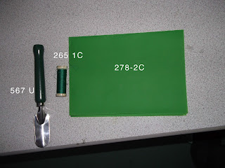
The final task involved matching the colours of our objects with pantone swatches. Below are the objects we looked at. We ordered them into hue, tint, and shade.


No comments:
Post a Comment