Monday, 6 February 2012

100 THINGS // Money Incinerated

 One of the facts I came across  was to do with how much money is burnt each year. I decided to create a poster to show this information. Below are some ideas I came up with.
 
 I decided to go with the pile of money on fire. I wanted to use hand rendered type again so I drew out a stack of coins and then traced some writing into the shape of the stack. But when it came to incorporating it into my digital design it did not look as good as I had hoped so decided to just use digital type.


 Using clipping masks I created this money silhouette image.
 I prefer the green image here. It is more relevant to money
I scanned in some type I had drawn and tried to incorporate it into the image but unfortunatley I dont think it has worked very well.


 I have experimented with type here, I think I like the top right image with the text along the bottom, It is subtle but I think it works best. I quite like it in capitals even though it is harder to read.

Sunday, 5 February 2012

100 THINGS // BANK NOTE CLAIMS

For the next 2 posters I used information I found online about the number of bank note claims made each year. I started by creating some bar charts on illustrator.


Next I drew a cash machine using the pen tool and adjusted the graphs so they looked right on the
screens. I kept the colour schemes simple for maximum impact

Finally I added some type I think it contrasts well on the black silhouette
If I had more time I would of liked to create some more interesting graphs.

Friday, 3 February 2012

100 THINGS FEED BACK

 Martin liked the concept of my ideas but did think I should scrap the idea of the 1st humming bird poster, also he recommended I changed some of the textured backgrounds. Since this crit I have made these alterations and kept all my products to a set colour scheme and theme sticking to a limited pallet. Also I have kept to 2 fonts, and hand rendered type, I used Times New Roman and Impact. This Crit has helped me with the direction to go in, I just need to get my designs ready for the final prints.


Final Crit

For the final crit suzanne and emma looked at my work, they understood my work and also liked the stock. They thought the silhoutte style drawings workd well too and liked my use of layering. However they did not know what context the products should be in. The products are for the general public and would be some sort of promotional hand out. They did not exactly what it was I am trying to communicate, this is probably because my products have quite broad information on, they are simple and short messages I have no real major content within the products, this is partly down to time as I switched topics half way through. If I had more time it would of been good to produce something a bit more informative such as a book with money tips and recesion facts also more infographic work. They suggested a newspaper which I feel is a good idea and would of been an interesting route to go down.


100 THINGS // CARDS

As I am looking at money I thought it might be a good idea to create a business card design with a cash converter on, although the exchange rate is always changing it something cheap and easy to produce that could be redistributed as the exchange rate changes. I also created a card to go in your wallet and purse with a reminder to spend responsibly. I stuck with the same colour scheme to keep the theme running throughout. I designed the cards so when they sit in the wallet or purse just the heading will stick out so you know what the card is. The cost cutter card has some simple questions on it to help aid your purchase to see whether or not the purchase is necesary.


Thursday, 2 February 2012

Wednesday, 1 February 2012

100 THINGS // BILLION POUNDS

For this poster my fact was : if you had 1 billion pounds and spent a pound every second it would take you 317 years to spend it all. I decided to use a till as my main image. I created this outline on illustrator.
 
 Next I created a masking layer to go onto the till by playing about with some shapes and images
 I figured imagery showing the stages of life would represent 
the 317 years needed to spend all that cash
I then hand drew some type displaying the fact then scanned it in.
Next  I live traced the text in and changed the colours using the paint tool.
 Ive tried to stick to one colour scheme throughout.
 I created a birthday cake image as an alternative solution

I finally settled for this image, I removed the sun like shape
and overlayed a till image to fit within the silhouette 
and also a stack of coins.

I think this poster has come out quite nicely 
I like the colours used as they work 
together well, and sit nicely on the
cream background.


100 THINGS // Money Lifespan // Poster

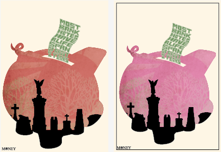
From my online research I found out most bank notes have a lifespan of 2 years before they are usually incinerated. I brainstormed a few ideas for my posters below:


I decided to go with the piggy bank idea and stick to the silhouette style imagery I had come up with. I wanted to have a mix of hand rendered type and digital imagery so I drew out some type in the shape of a wavy bank note then scanned the type in and live traced it. From here I played about with it until it worked with my Image.


I played about with clipping masks to create the piggy bank image, I decided to use a silhouette of a grave yard to signify the death of the bank note. After many different colour changes I finally decided that the pink piggy bank worked best.