Sign Placement
I have decided the appropriate place to position my posters would to be in the form of road signs and bill boards. My proverb is a lesson that is relevant to everybody I feel and the posters can be seen on everyone's drive of life. They will be easily visible to all, the only issue may be that people may get confused and think they are actual road signs so I would place the road signs in a position that would not make it confusing.
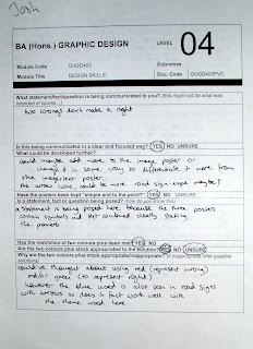
Crit Feedback
Emily's Feedback
I am quite happy with Emily's feedback, she liked the idea of it and understood it all which is good. She did mention that I should look at Red as a colour, I did look at red in my initial Ideas but I felt this wasn't very road sign like however I do agree with her thinking. She also mentions that I should of varied my images used a little bit, I think this is a good idea and If I had had more time I would of looked into this, i was concentrating more on keeping them in a series. At least now I will know where to make improvements in my development stages when designing, I need a bigger variety of work.


No comments:
Post a Comment